miércoles, 9 de noviembre de 2022

TRANS Architectuur & V+ > Leietheater Deinze

Source: TRANS V+

Photographer: Stijn Bollaert

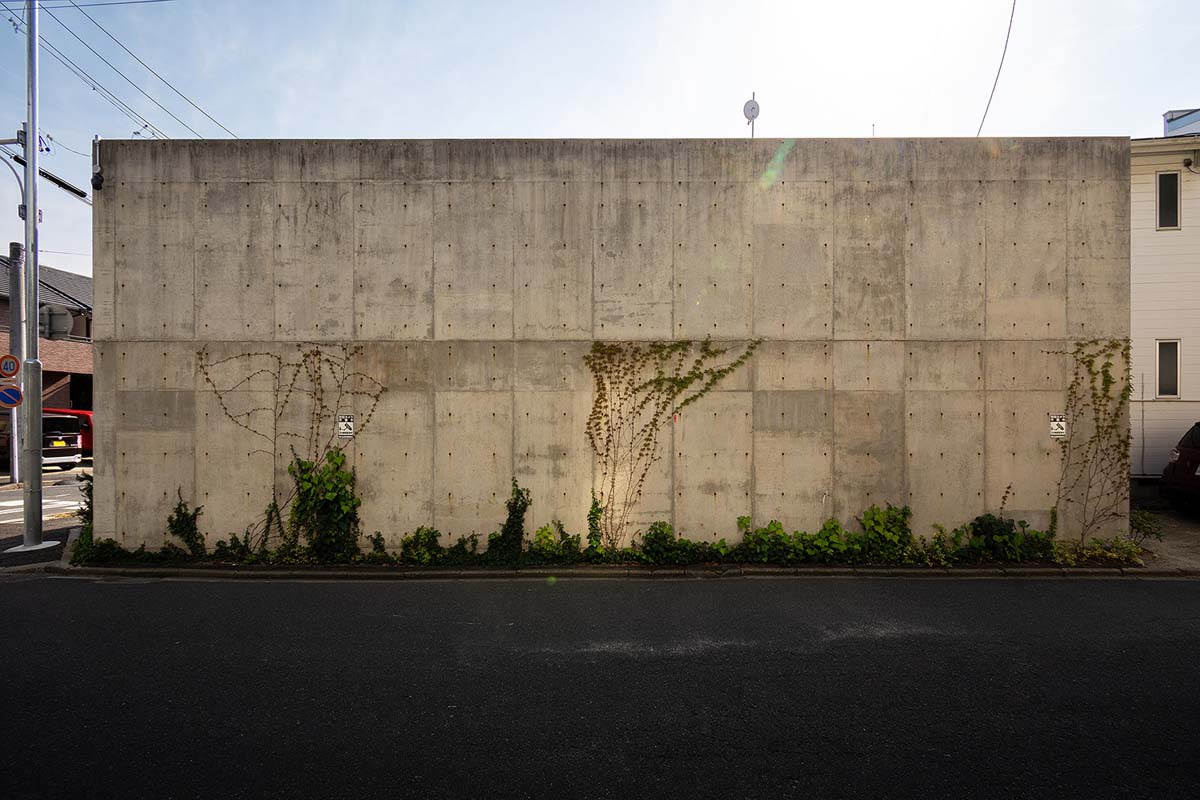
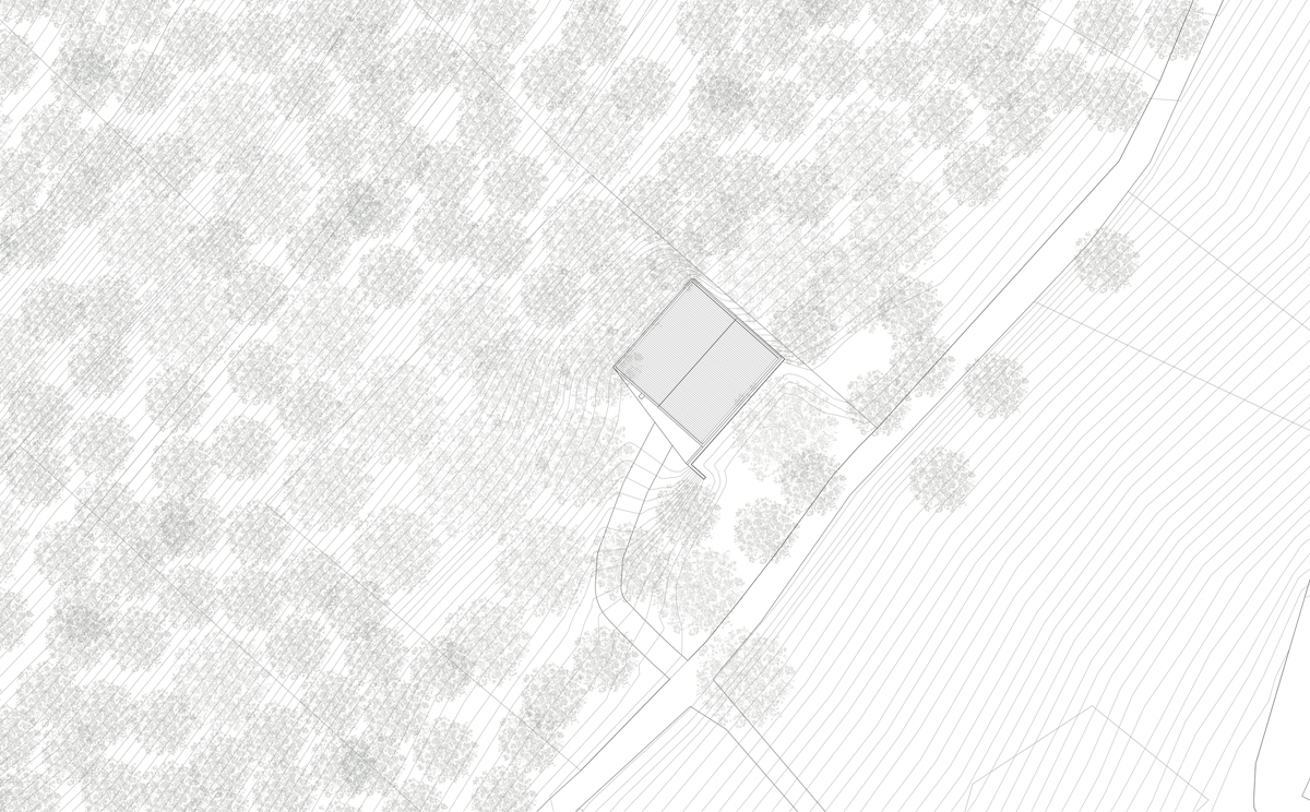
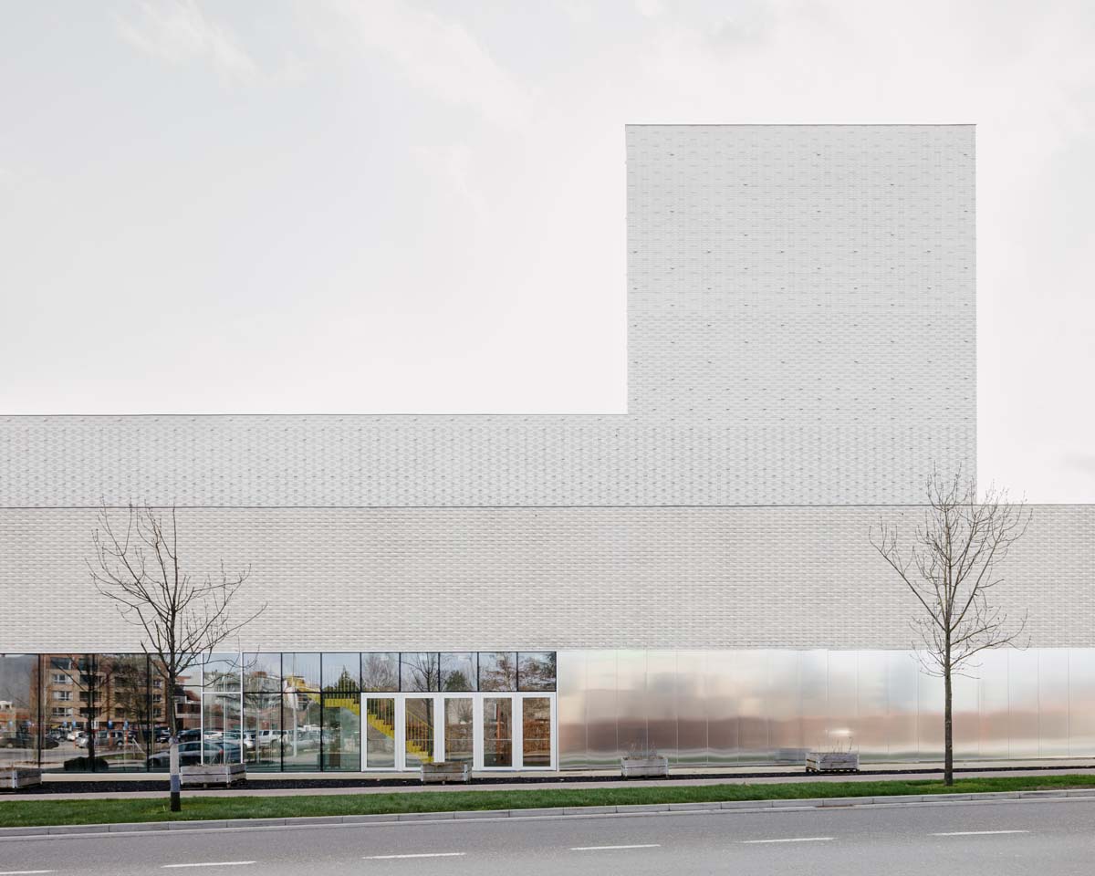
The Leietheater ‘takes a step aside’. The building plays a key role in defining the public space and making the heritage of Deinze visible again. TRANS V+ proposed an alternative site to the client during the competition phase. This move creates a large park that extends as far as the River Leie. In addition, the theatre was placed on important sight axes and was thus made present in the city. The Museum van Deinze en de Leiestreek, which had drifted into the open space of the old Leiearm, is framed and is once again the cultural heart of Deinze.

The park was designed by Marie-Josée van Hee architecten and connects the theatre along the Administrative Centre, designed by Tony Fretton architects, with the centre square on the Leiebocht. This is also where the Stedelijke Academie appears, a place where young talent is trained and possibly finds their way back to the stage in the Leietheater.

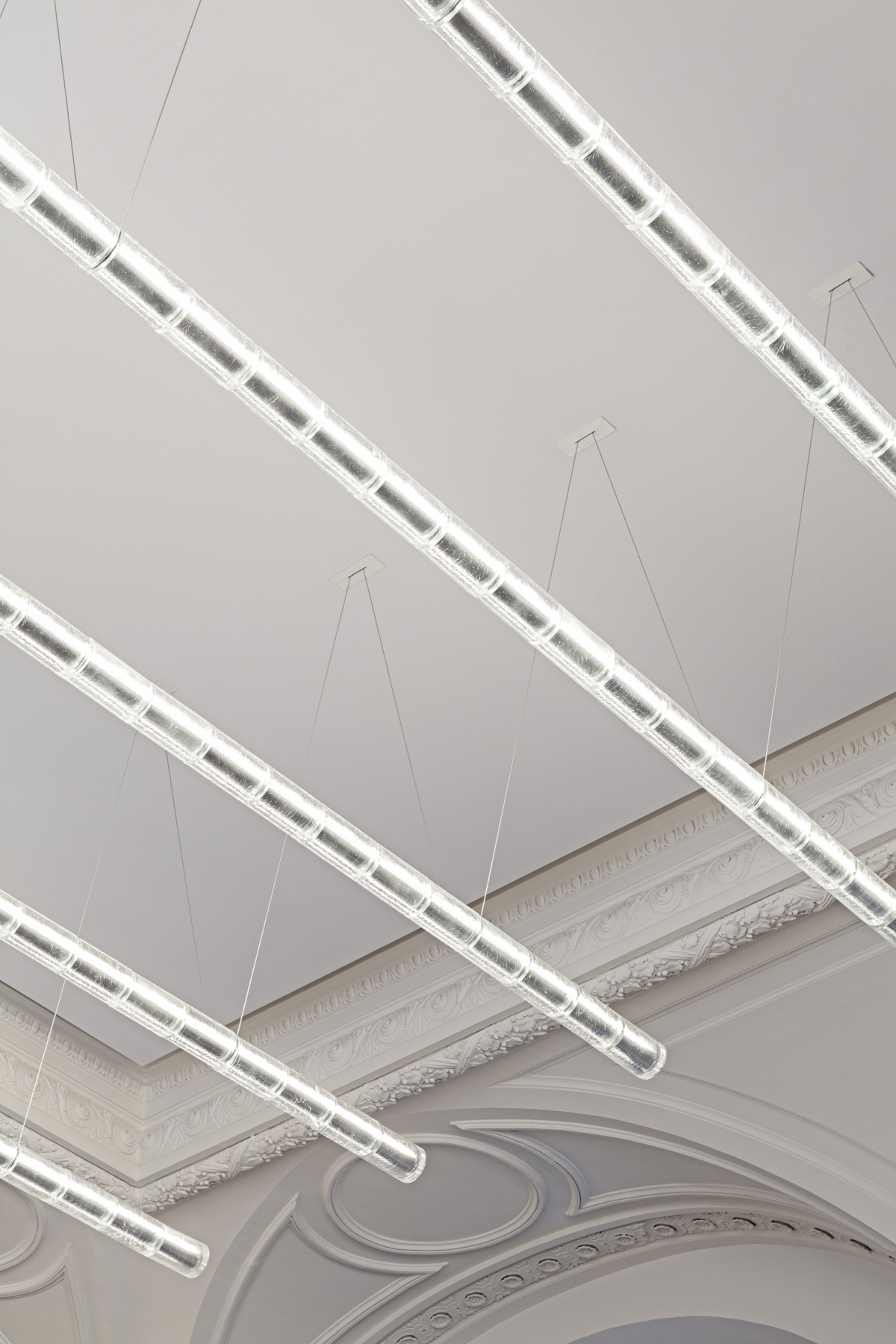
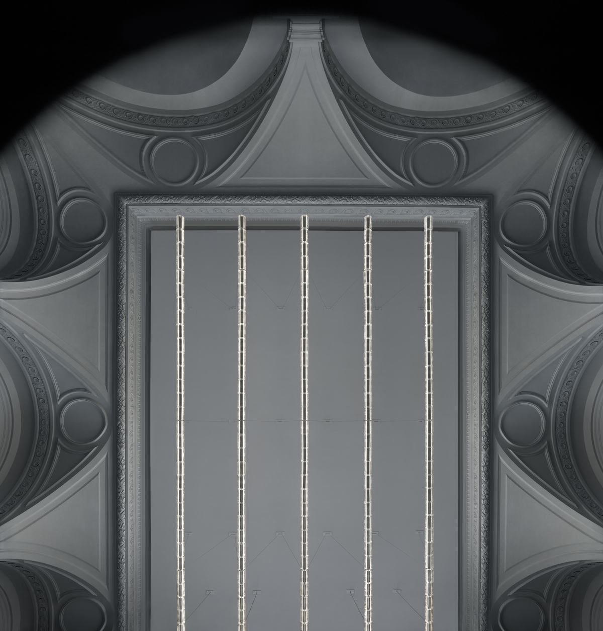
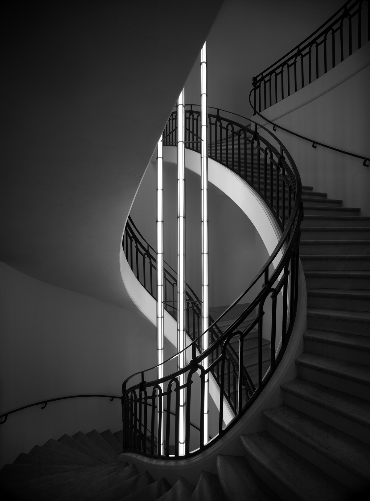
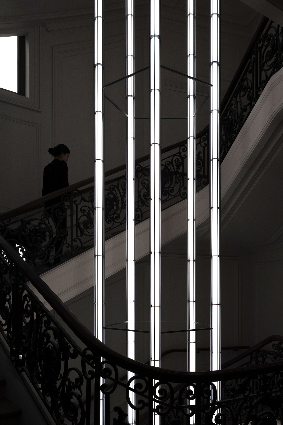
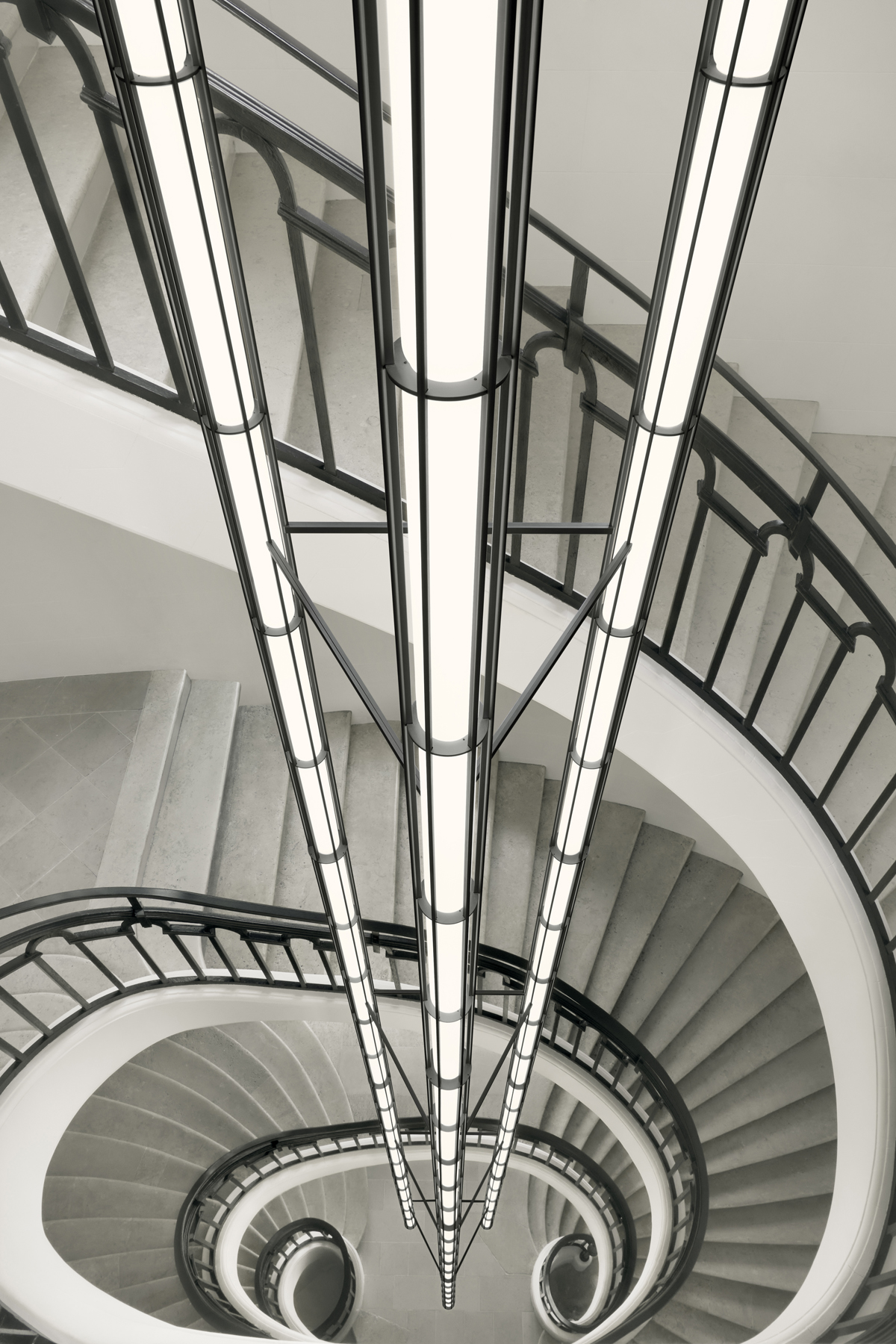
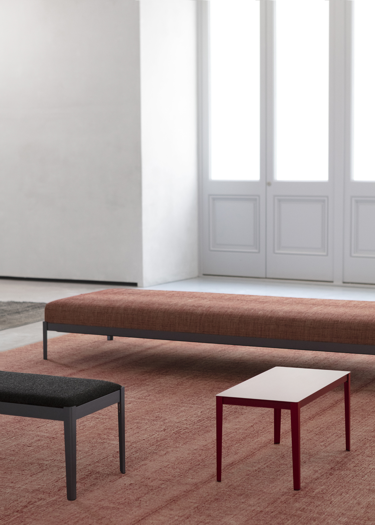
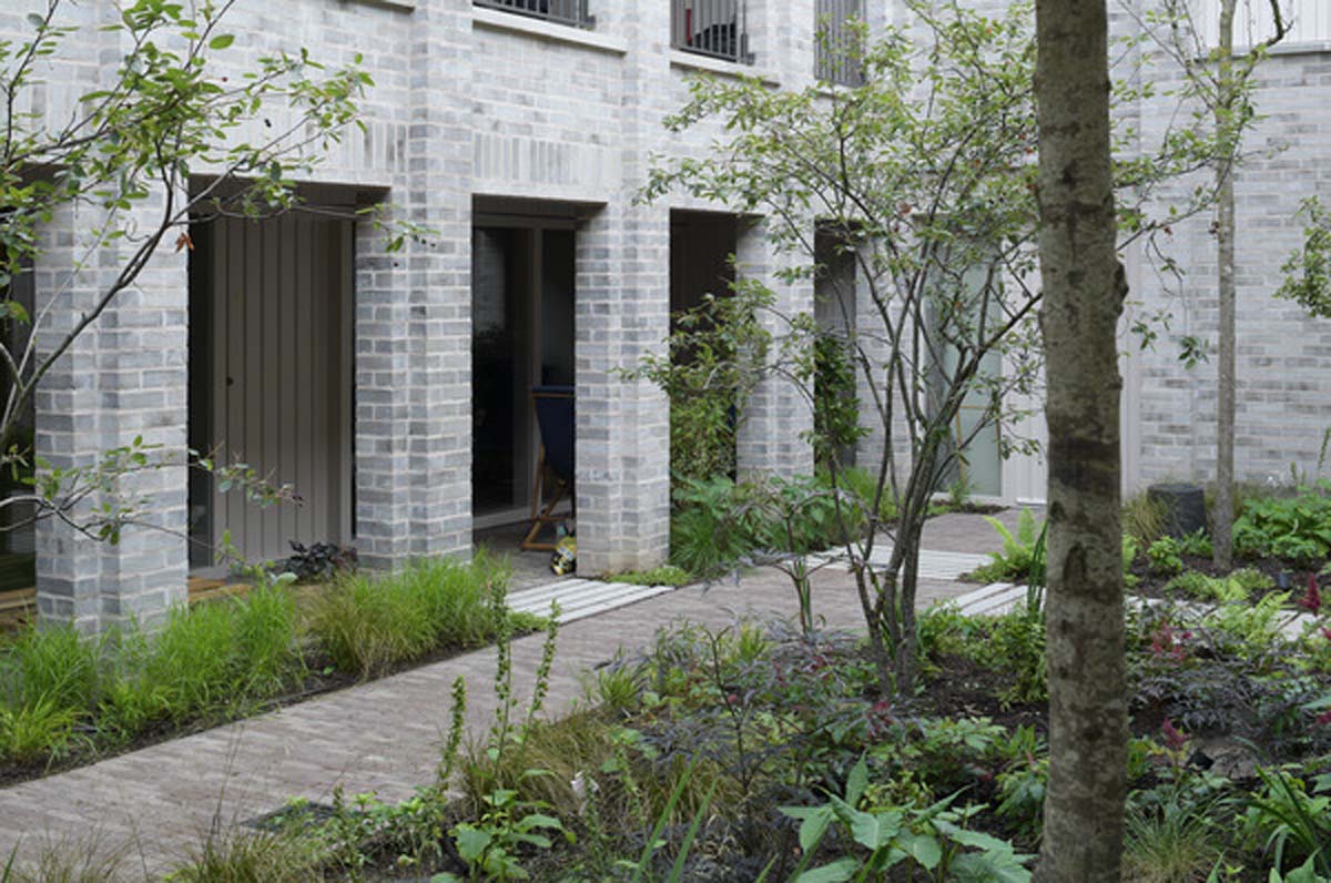
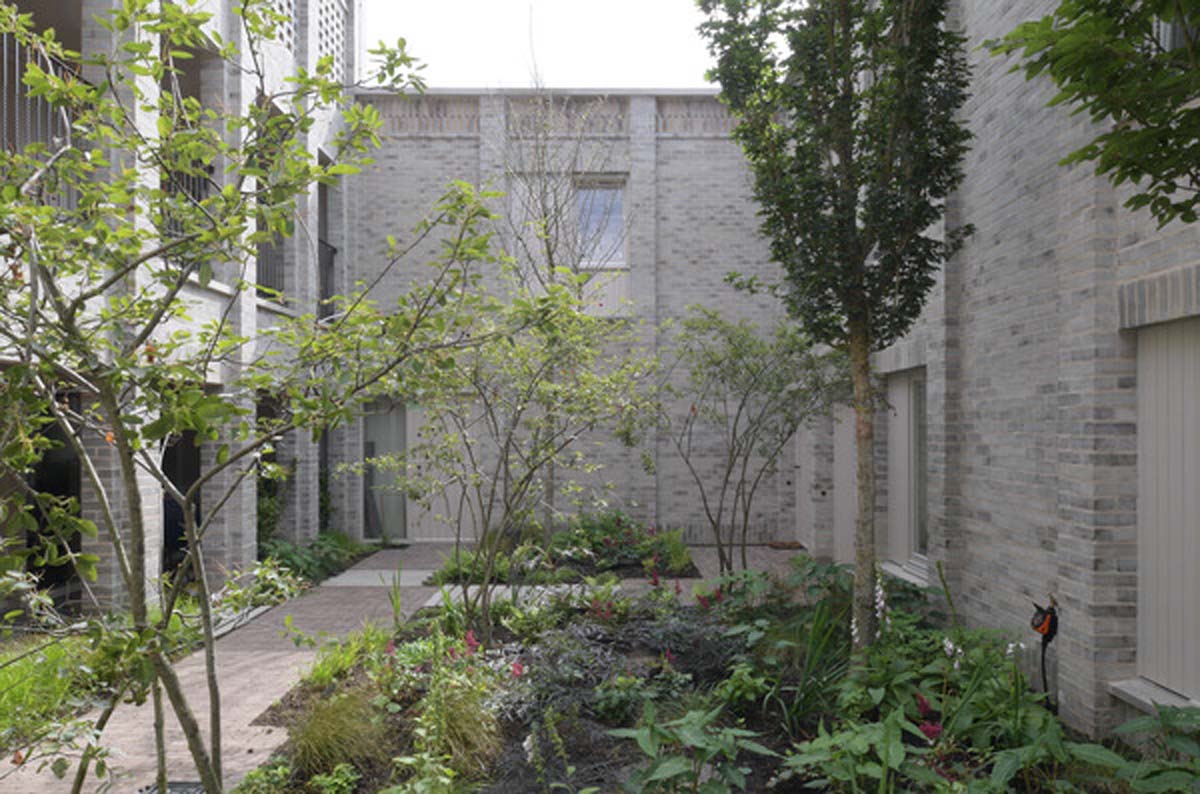
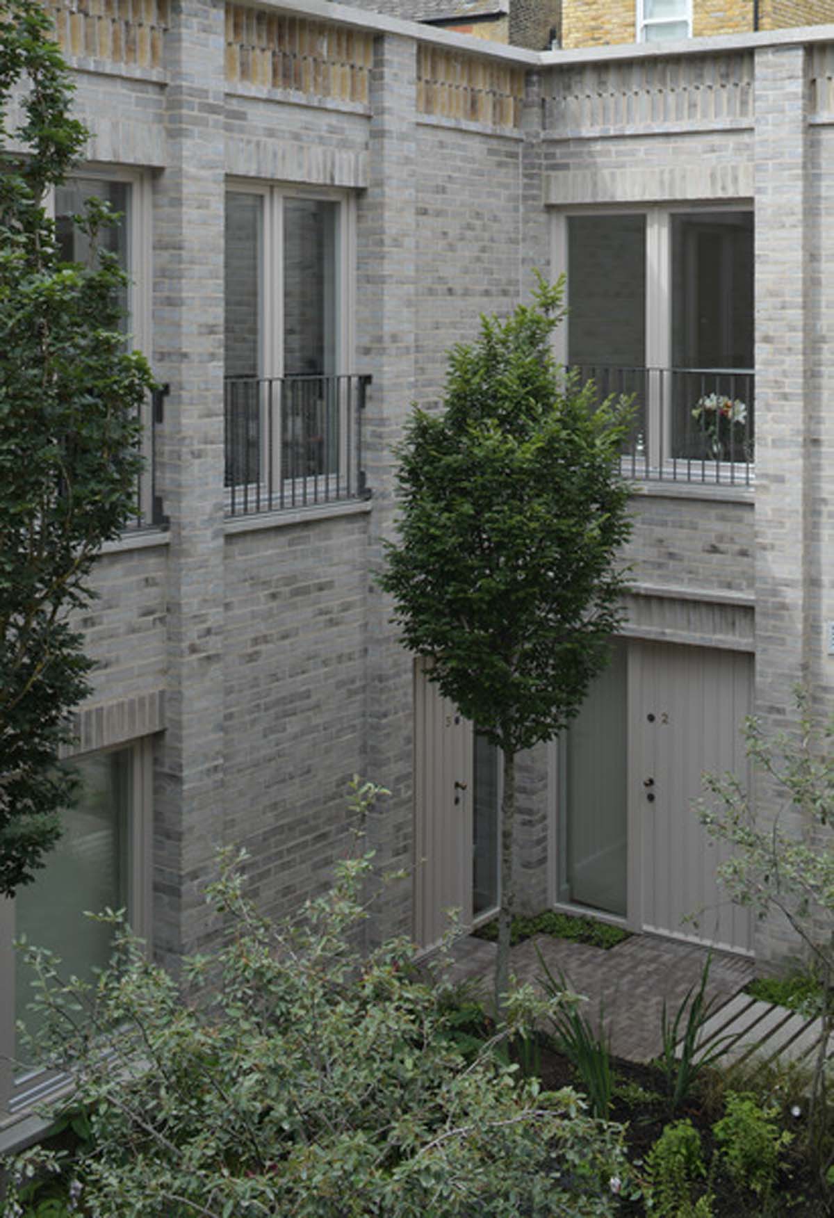
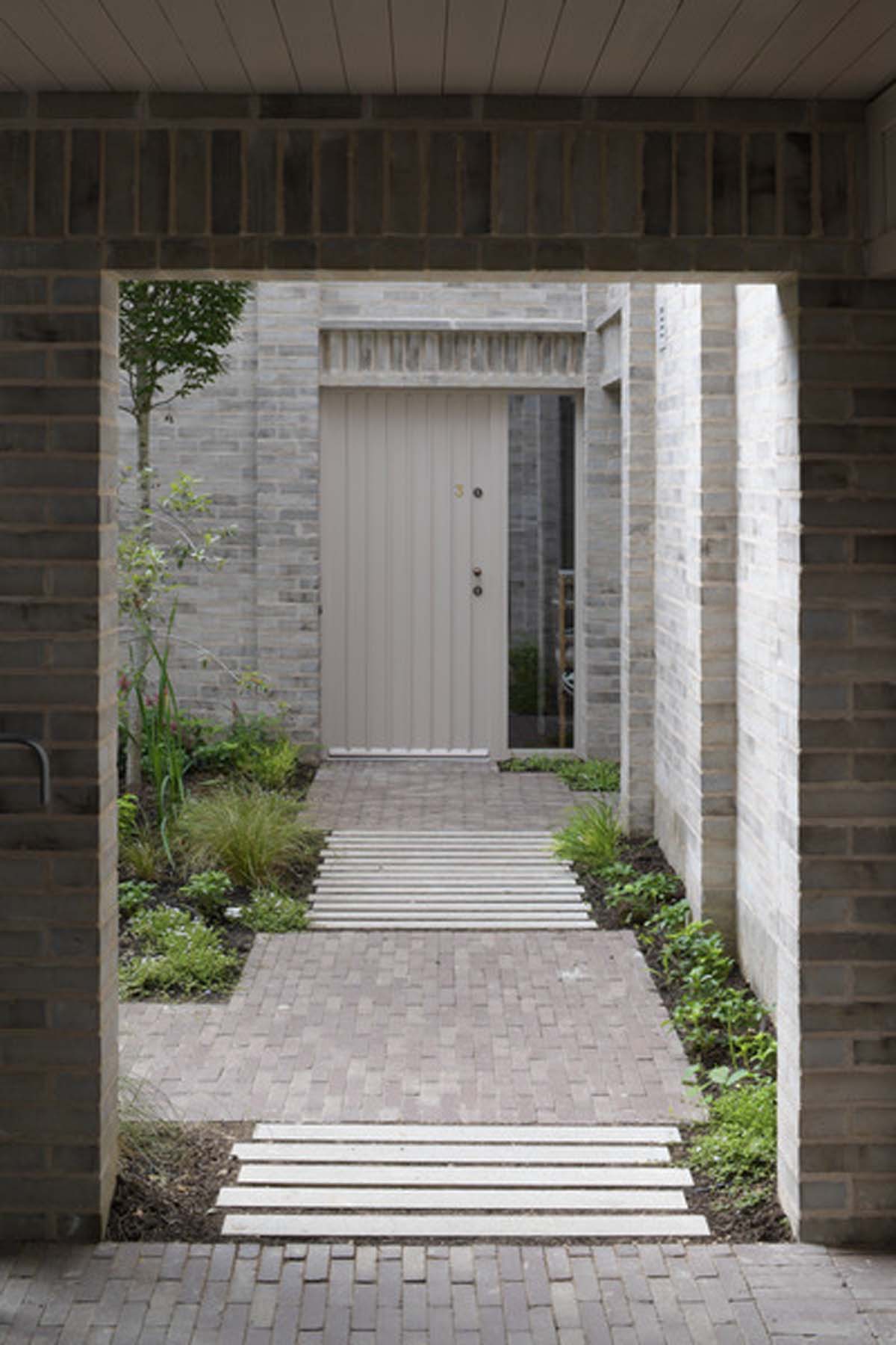
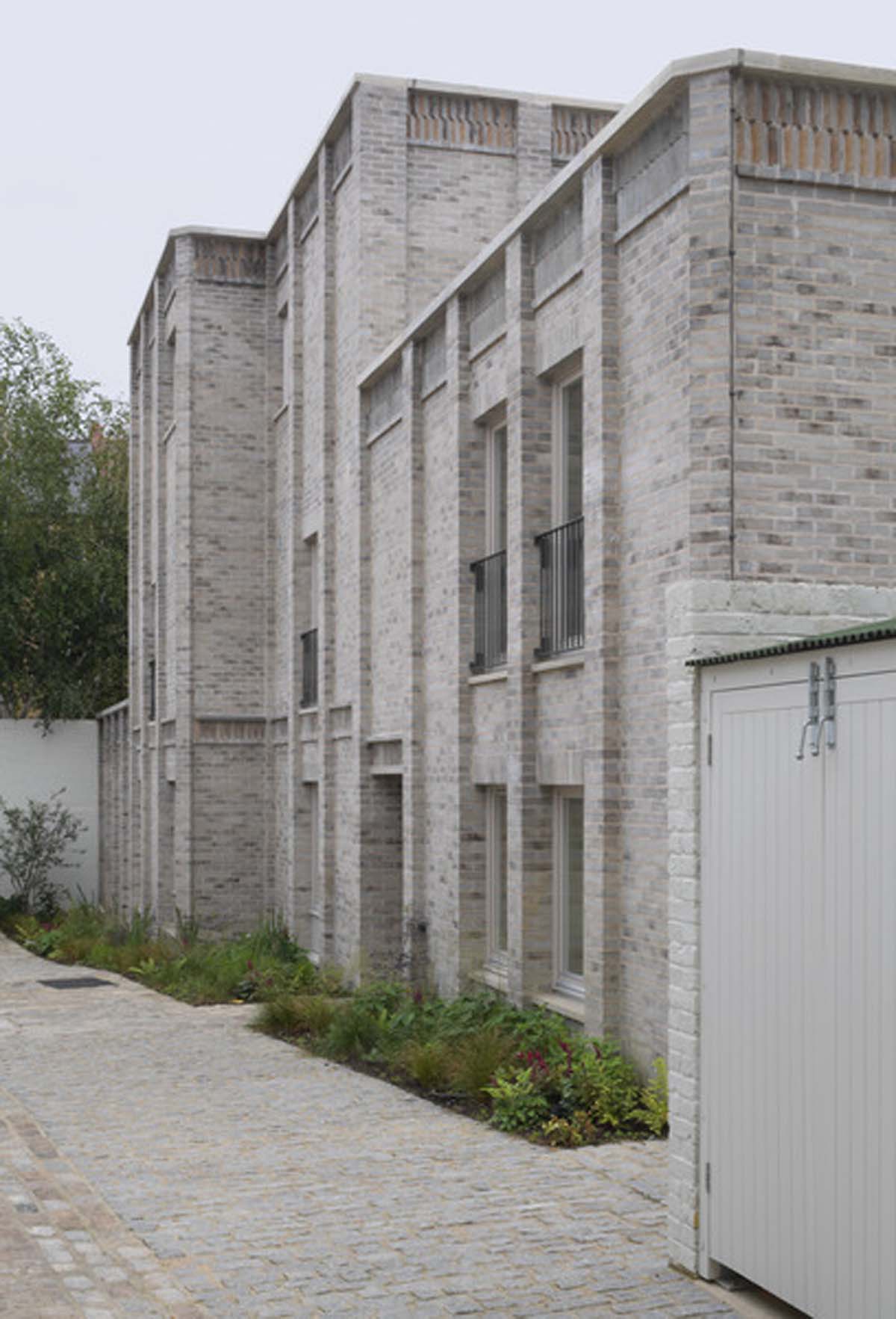
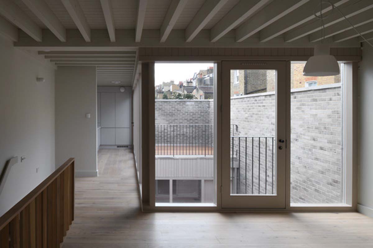
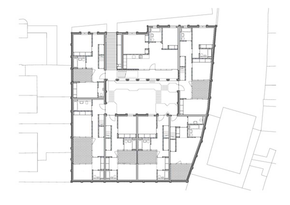
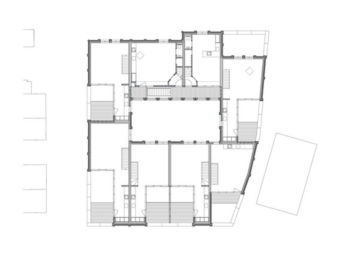
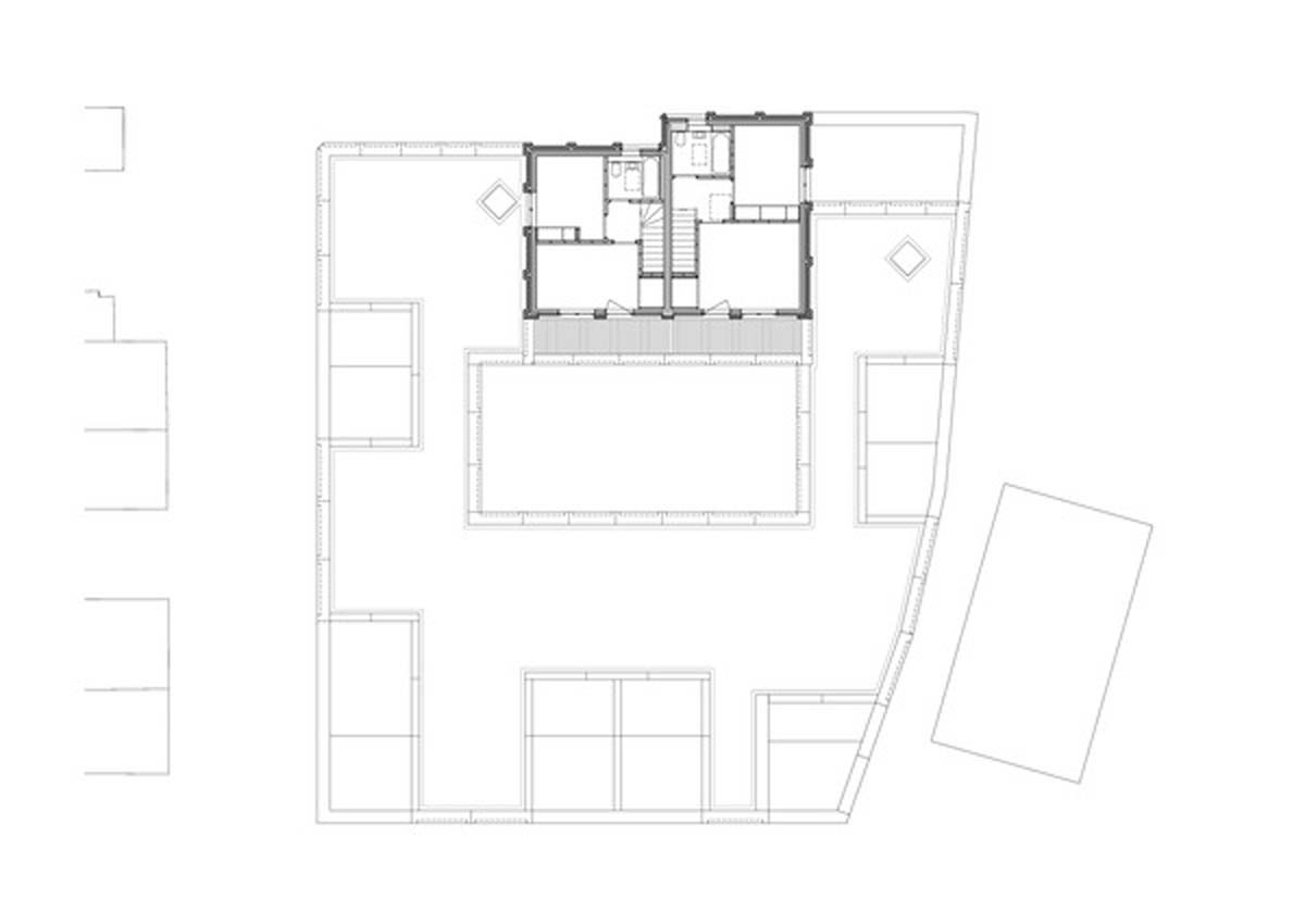
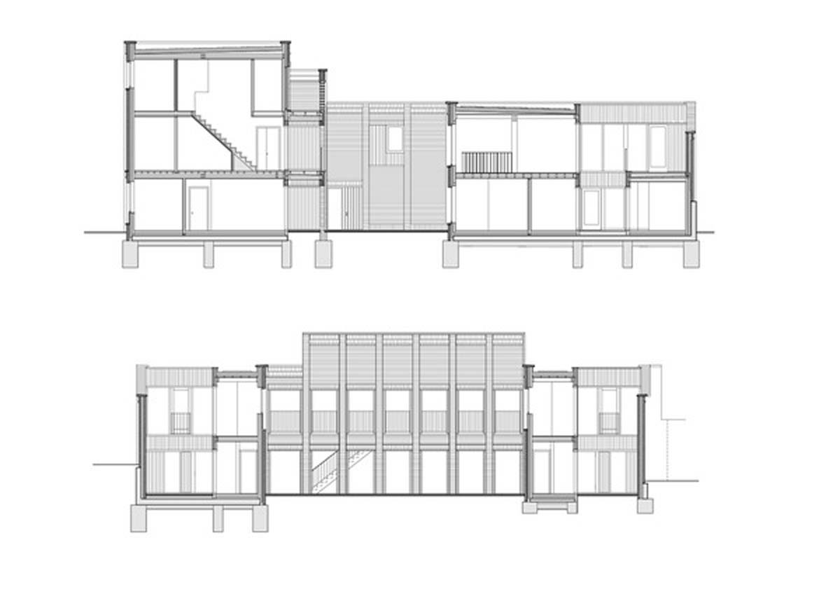
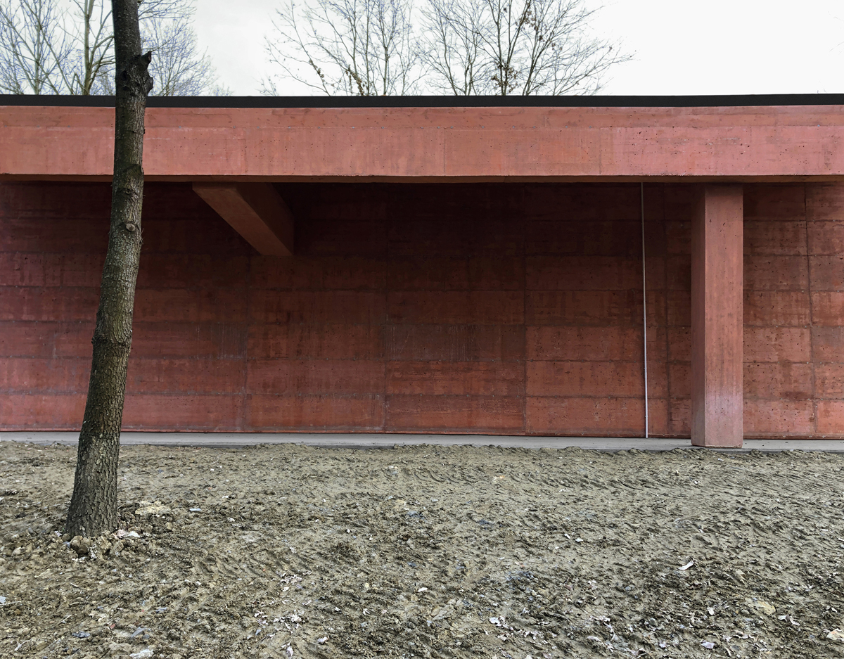
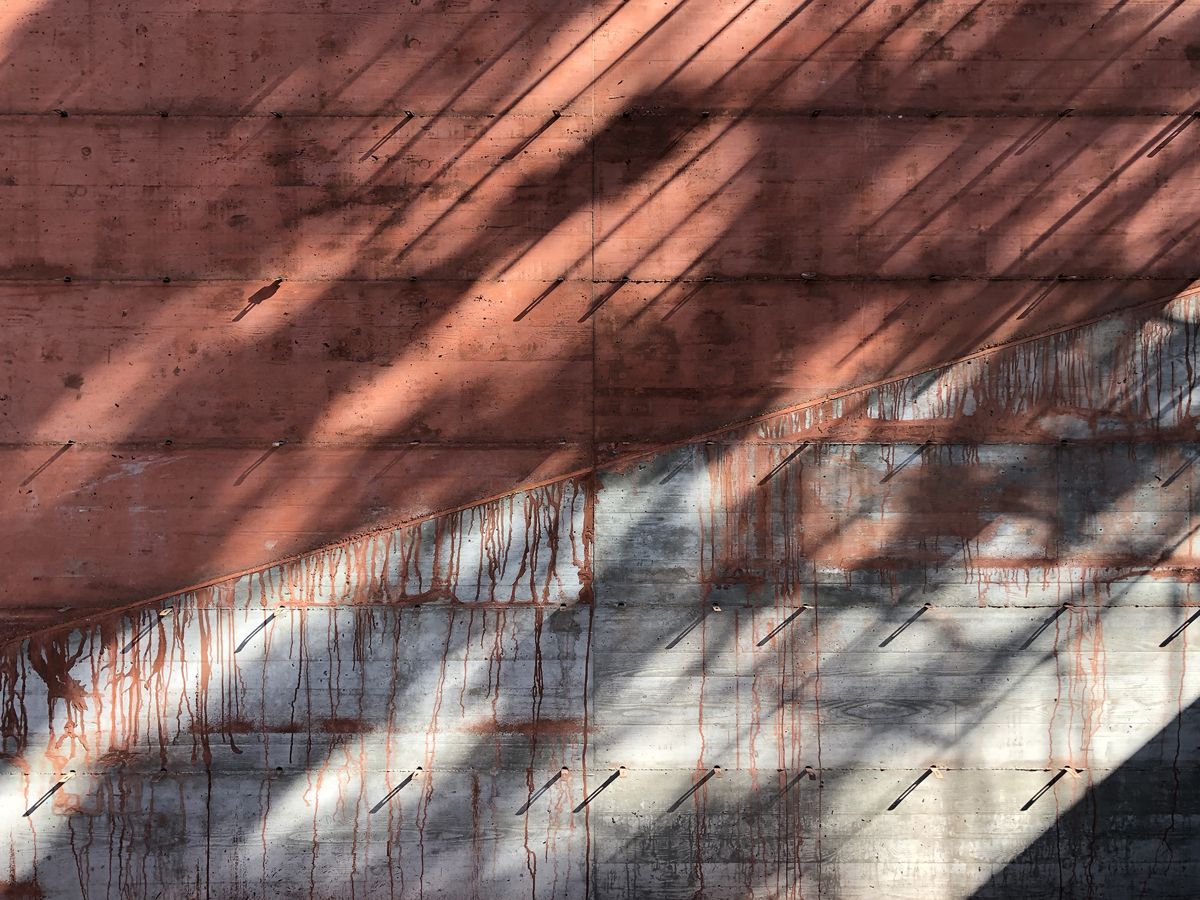
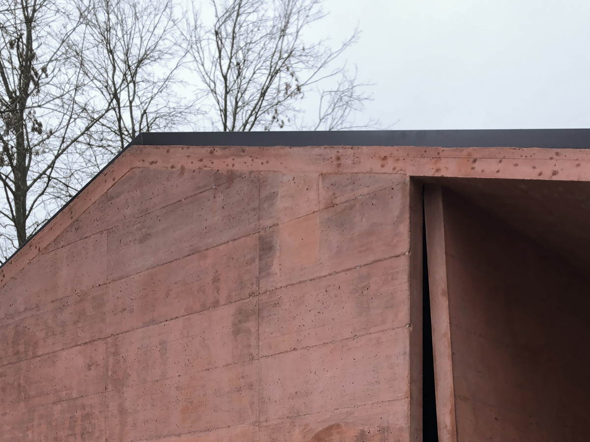
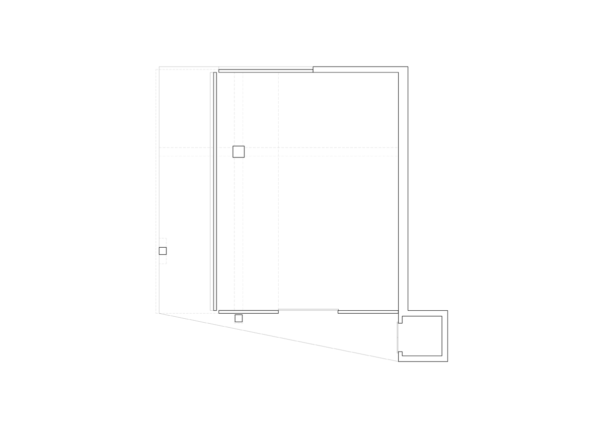
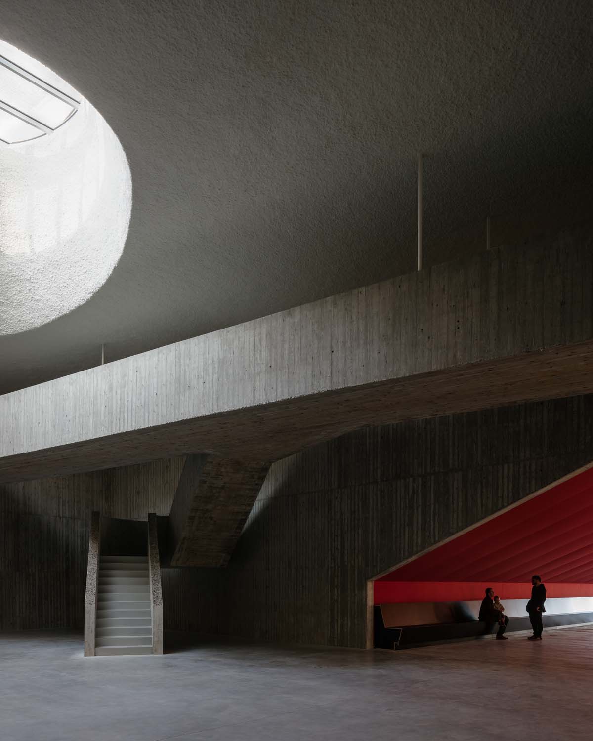
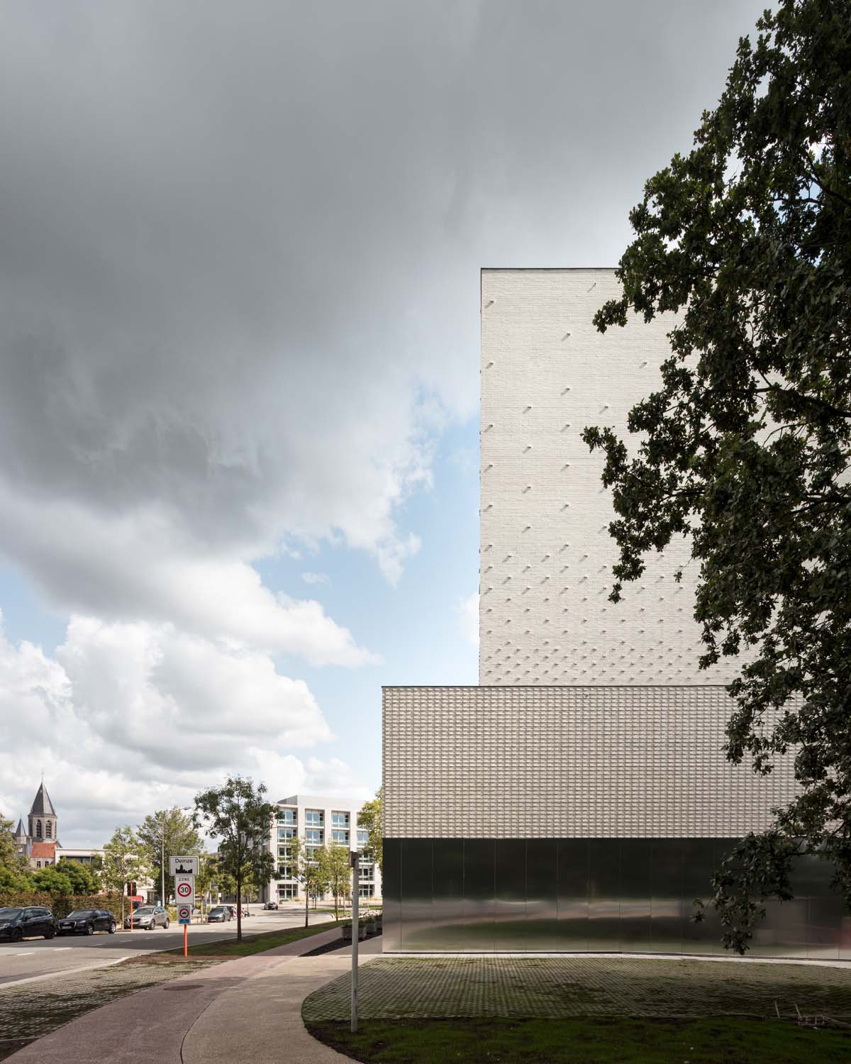
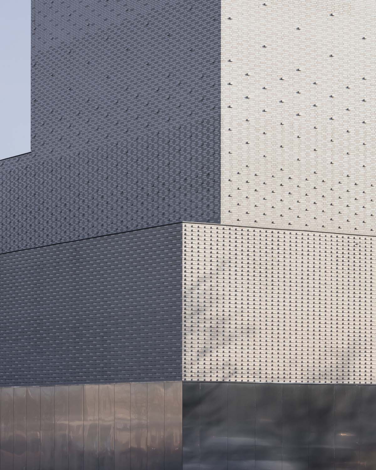
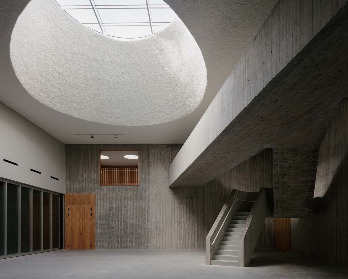
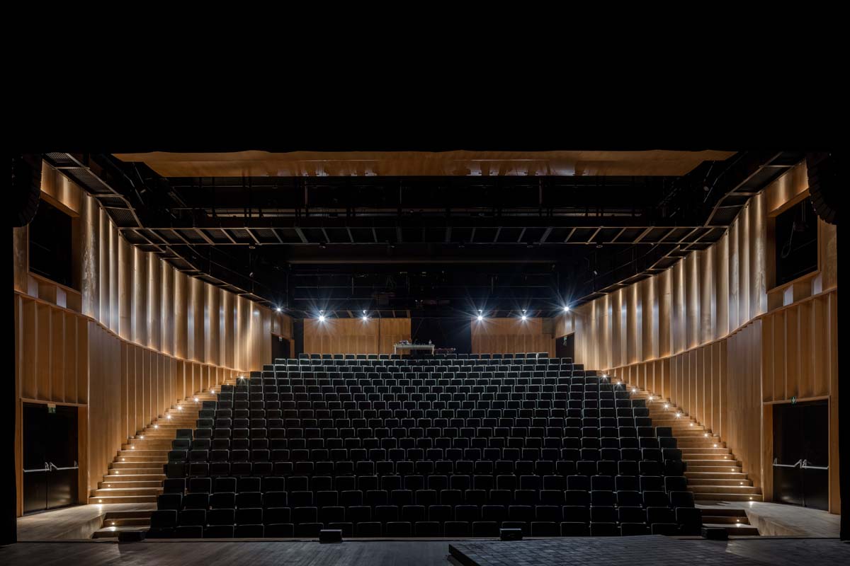
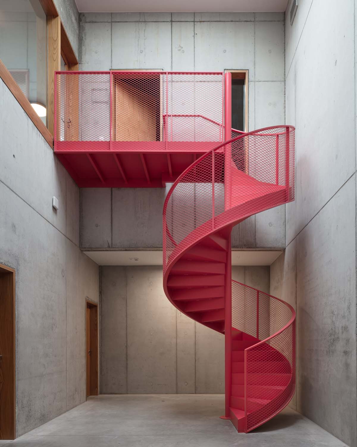
In a square floor plan, the programme components are arranged around a central foyer with a monumental skylight. The foyer can be expanded by sliding the partition wall with the multifunctional hall away. The museum is in the picture. With a café on the corner, the building activates the public domain in a place where otherwise, after the opening hours of the theatre, a pauze would arise in the urban dynamic. The large auditorium with its theatre tower gives the building a characteristic silhouette. The brick dress is made up of glazed and matt white stones in a pattern that is laid over the stack of volumes and, depending on the weather conditions, lights up softly or brightly. A silent gesture to Emiel Claus.

The post TRANS Architectuur & V+ > Leietheater Deinze first appeared on HIC Arquitectura.


Esta entrada aparece primero en HIC Arquitectura http://hicarquitectura.com/2022/11/trans-architectuur-v-leietheater-deinze/

lunes, 7 de noviembre de 2022

Tomoaki Uno Architects > Sako House

Source: Tomoaki Uno Architects

Photographer: Yasuo Hagiwara

The client is a middle-aged university professor majoring in design. It is a single person’s house.
He was his fifth home this time. His requests were clear from past experience. It was a universal architecture suitable for the final residence.
In response to his desire to read and live on a spiral staircase, half of the floor space was turned into a spiral staircase. It is a simple plan, but when we go to the study on the second floor, we fall into a mysterious sensation of getting lost in the maze. Five kinds of skylights bring various expressions to the room depending on the season, time and weather.
It seems that you can spend all seasons comfortably because the insulation is put into the concrete wall.


The post Tomoaki Uno Architects > Sako House first appeared on HIC Arquitectura.


Esta entrada aparece primero en HIC Arquitectura http://hicarquitectura.com/2022/11/tomoaki-uno-architects-sako-house/

viernes, 4 de noviembre de 2022

Bouroullec > Pinault Collection, Bourse de Commerce

Source: Ronan & Erwan Bouroullec

Photography: Claire Lavabre, Tommaso Sartori

Invited to design the public square and furnishings, exterior and interior, for the new Bourse de Commerce – Pinault Collection contemporary art museum, Ronan and Erwan Bouroullec have created a wide-ranging project to define each space. Each arrangement has been used to instil a particular atmosphere within its context, and is the result of detailed research and collaboration with a variety of highly skilled manufacturers and craftsmen.

Arriving in the Rue de Viarmes, visitors to the museum are heralded by three vast sails shimmering in the breeze like rippling liquid. Bearing neither motif nor insignia, these majestic, 20m2 flags summon passers-by, capturing and reflecting light against the Paris sky, their constant movement echoed by gently rotating windmills at their extremity. The flags are carried high on 13m flagpoles that slot seamlessly into specially cast, boulder-like forms at their bases, each weighing around 3 tonnes.

Arranged around the building, these masts are united by a series of seven low bench–barriers, each 12 metres long, that follow the curve of the narrow pedestrian street that encircles the building. Based on a system of specially made aluminium-bronze tubes, these elegant furnishings emphasise the curving geometry of the building, providing seating and creating a new, eminently Parisian public space for museum visitors and passers-by alike.

Of extreme simplicity, the monumental Luce Orizzontale light suspended in the entrance hall brings together the pinnacles of technical skill and craftsmanship. An interlocking structure, the light is composed of five bars of tubular pieces in cast glass and aluminium. Each horizontal bar measures 6 metres and is composed of 30 cylinders of cast glass specially developed by WonderGlass in their workshops near Venice.

To the rear of the building is the grand stairwell containing a spectacular double-helix staircase, at the centre of which Ronan and Erwan Bouroullec have installed a third Luce Verticale, comprised of three vertical elements, each formed of 25 pieces of glass, arranged in triangular formation. Monumentality is guaranteed by this great light, whose 12 metres span the entire height, from ground-floor to ceiling.

The furniture was specially adapted for the restaurant by Magis from the existing Officina collection in wrought iron, also used for the lamps. Wrought iron, felted wool, rugs like lichen on rock, the references lie somewhere between the Bras family’s native Aubrac and the very carefully selected materials and skilful assemblies that enable the gentle and ingenious simplicity of the Bouroullecs’ work.

Claire Lavabre / Studio Bouroullec

Claire Lavabre / Studio Bouroullec

Claire Lavabre / Studio Bouroullec

Claire Lavabre / Studio Bouroullec

Claire Lavabre / Studio Bouroullec

Tommaso Sartori

Claire Lavabre / Studio Bouroullec

Claire Lavabre / Studio Bouroullec

Tommaso Sartori

Tommaso Sartori

Claire Lavabre / Studio Bouroullec

Claire Lavabre / Studio Bouroullec

Claire Lavabre / Studio Bouroullec

Claire Lavabre / Studio Bouroullec

Claire Lavabre / Studio Bouroullec

Claire Lavabre / Studio Bouroullec

The post Bouroullec > Pinault Collection, Bourse de Commerce first appeared on HIC Arquitectura.


Esta entrada aparece primero en HIC Arquitectura http://hicarquitectura.com/2022/11/bouroullec-tadao-ando-architect-pinault-collection-bourse-de-commerce/

miércoles, 2 de noviembre de 2022

Sergison Bates Architects > Lavender Hill Courtyard Housing


Source: Sergison Bates Architects

Photographer: David Grandorge

The project involves the redevelopment of a former sheet metal workshop first converted for use as offices in the 1980s into a community of courtyard houses with a shared garden at their centre. The triangular site is bounded on all sides by terraced houses and gardens that slope steeply towards the south and accessed through an arched opening and inner mews street. This gives it a secluded, inward character, despite its proximity to the busy shopping and commuting street that links Clapham to Battersea.
Linked to the quiet mews to the north by a timber-lined passageway, the ensemble has a communal character. Inside and outside spaces merge in an informal way across various thresholds and levels: and clay brick pathways lead through the densely planted garden, to the apartments’ front doors where an area big enough for a couple of chairs can be used in the manner of a stoop.
The nine dwellings ranging in size from 65 to 105m2 are generally arranged around a private courtyard space at ground floor level and a timber-decked terrace on the first floor. Bedrooms are on the lower floor level, with windows opening onto communal or private courtyards. A winding stair leads to the first floor living spaces, which are open to daylight and views. The interiors have the character of a light industrial workshop rather than a conventional domestic setting, with high ceilings of exposed ceiling joists, terracotta and oak-boarded floors and painted timber wall panelling. The arrangement of glazed screens and terraces reinforces the perception of a fluid set of internal and external rooms.
Whilst the building is generally two-storey high, it rises to three on the northern side, with a more imposing stepped facade to the mews. On the courtyard side its scale is attenuated by an open loggia accessed by a metal stairway leading to a first-floor external landing which provides both access and private amenity spaces overlooking the garden. Flat roofs planted with sedum and hardy flowering plants create a micro-green habitat.
Like the interiors, the new facades reflect the Victorian industrial heritage of the site. Vertical pilasters subdivide the facades lending them classically elegant vertical proportions, while twisted soldier course friezes and lintels have an ornamental character and evoke the sense of solidity and permanence of the robust warehouse-like industrial architecture of the past. The light grey slop moulded brick used for all external walls has an engobe finish – a coloured slip applied to the brick prior to firing that results in a variety of tints. Combined with a flush mortar joint, this gives the walls a handmade texture that is accentuated by changes in daylight.
Tucked away within the urban block and visible only partially through the gateway entrance at the end of the mews, the project is a case study in the re-appropriation of a residual brownfield site to house a small-scale urban community.


GIA: 795 m2
Completion: April 2021
Client: Marston Properties Ltd
Contractor: Uprise
Cost consultant: Marick
Structural Engineer: Symmetries
MEP Engineer: Mendick Waring Ltd
Landscaping: Miria Harris

The post Sergison Bates Architects > Lavender Hill Courtyard Housing first appeared on HIC Arquitectura.


Esta entrada aparece primero en HIC Arquitectura http://hicarquitectura.com/2022/10/sergison-bates-architects-lavender-hill-courtyard-housing/

miércoles, 26 de octubre de 2022

VG13 Architects > Warehouse for tractors

Sources: VG13 Architects

Photography: Alberto Rossi

The simplicity of the program allows an elementary yet refined construction.
Thin reinforced concrete surfaces are folded around a pillars and beams system, giving
the impression of a lightweight wrap, which is, nevertheless, part of a precise structural
system. The exception to the system is the slightly inclined wall, which opens the space
to let some light in.
The formula for the red pigmented concrete is defined to match the color of the terracotta
roof tiles, which are mandatory in the UNESCO buffer zone in which the project is located,
in order to make the building appear as a homogeneous whole.
Foundations and earth retaining walls — which represent the largest amount of concrete
used in the building — are cast in cheaper grey concrete, due to economic and semantic
reasons.
The formal result is an expression of synthesis between the spatial and constructive intention,
as well as its cultural, physical and economical context.

Architecture: VG13 Architects – Tommaso Fantini & Alberto Rossi

Location: Undisclosed

Project: 2018

Construction: 2019-2020


The post VG13 Architects > Warehouse for tractors first appeared on HIC Arquitectura.


Esta entrada aparece primero en HIC Arquitectura http://hicarquitectura.com/2022/10/vg13-architects-warehouse-for-tractors/

martes, 25 de octubre de 2022

OMA > Maggie’s Centre Glasgow


Source: OMA

Photographer: Iwan Baan

The aim of a Maggie’s Centre is to provide an environment of practical and emotional support for people with cancer, their families and friends. Since the opening of the first Maggie’s Centre in Edinburgh in 1996, the Maggie’s Cancer Caring Centres foundation has grown substantially, commissioning and developing a series of innovative buildings designed by world class architects. While contemporary architecture has a reputation, deservedly or not, for being at times cold or alienating, the goal of each Maggie’s Centre – whether in Glasgow, London, or Hong Kong – is to provide a space where people feel at home and cared for, a space that is warm, receptive, and welcoming.

Maggie’s Centres rely on the fundamental precept, often overlooked, that exceptional architecture and innovative spaces can make people feel better – thereby kindling the curiosity and imagination fundamental to feeling alive. Grand in their ambitions, but designed on a small scale, Maggie’s Centres provide a welcome respite from typical institutional hospital architecture. Their spaces are more than merely functional; they serve as a haven for those receiving treatment. In creating a place to connect and learn from others who are going through similar experiences, Maggie’s Centres help patients to develop their sense of confidence and resourcefulness.

In 2007, Maggie’s Centre approached OMA to design a new centre on the grounds of Gartnavel hospital in Glasgow, close to the Beatson West of Scotland Cancer Centre. OMA designed a single-level building in the form of a ring of interlocking rooms surrounding an internal landscaped courtyard. Seemingly haphazardly arranged, the building is actually a careful composition of spaces responding to the needs of a Maggie’s Centre and providing a refuge for those coping with cancer.

Instead of a series of isolated rooms, the building is designed as a sequence of interconnected L-shaped figures in plan that create clearly distinguished areas – an arrangement that minimises the need for corridors and hallways and allows the rooms to flow. The plan has been organized for the spaces to feel casual, almost carefree, allowing one to feel at ease and at home, part of an empathetic community of people. At the same time the design also provides spaces for more personal moments – either in the intimate setting of the counselling rooms, or in smaller nooks and private spaces.

Located in a natural setting, like a pavilion in the woods, the building is both introverted and extroverted: each space has a relationship either to the internal courtyard or to the surrounding woodland and greenery, while certain moments provide views of Glasgow beyond. With a flat roof and floor levels that respond to the natural topography, the rooms vary in height, with the more intimate areas programmed for private uses such as counselling, and more open and spacious zones for communal use. More than any other space, the internal courtyard provides a place of sanctuary and respite.

The post OMA > Maggie’s Centre Glasgow first appeared on HIC Arquitectura.


Esta entrada aparece primero en HIC Arquitectura http://hicarquitectura.com/2022/10/oma-maggies-centre/

lunes, 24 de octubre de 2022

Peter Celsing > Kulturhuset. 1974

00

Designed and built by Peter Celsing, the Kulturhuset is located on Sergels Torg in Stockholm, one of the busiest squares in the Swedish capital. This complex was conceived as a “cultural oasis” in the new business and commercial center. In this area of the city, from the 1950s to the early 1970s, the old structure and architecture of Stockholm, and partly even the topography, was almost completely replaced. The building which opened in 1974 is considered the most famous work of Peter Celsing, apart from his sacral buildings.

Towards the Sergels Torg, the facade is mainly made of glass, so that the building opens up to the public and gives the culture the desired presence to the square. In contrast, the backside of this elongated structure is completely closed. The exposed concrete structure is one of the most striking features of this building. On the lower floor there is an open library, on the upper floors there are rooms for exhibitions. Originally, the Moderna Museet was intended to occupy large parts of the building, however, the museum withdrew from these plans in 1969.

The building complex consists of two main components, with the aforementioned concrete and glass building complemented by the theater, which rises above a simple, square floor plan. The facades of the theater are made of stainless steel panels, which also emphasize the horizontal. The main façade of the square is in dialogue with Edvin Ohrstrom’s vertically rising steel-and-glass sculpture Kristallvertikalaccent ‘, which is located on the square about 10 meters below.


The post Peter Celsing > Kulturhuset. 1974 first appeared on HIC Arquitectura.


Esta entrada aparece primero en HIC Arquitectura http://hicarquitectura.com/2022/10/peter-celsing-kulturhuset-1974/