John Morgan Studio
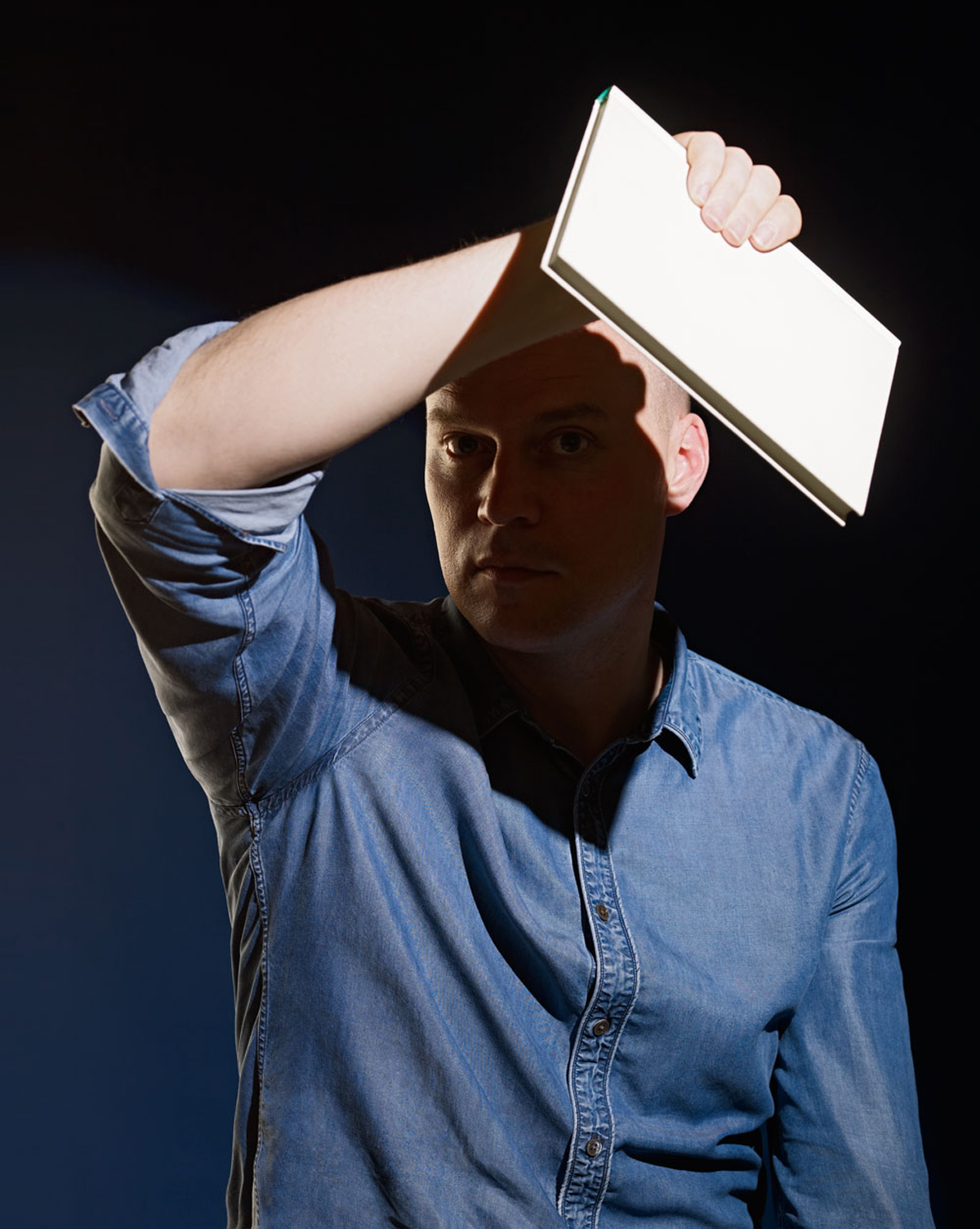
EYE MAGAZINE: Devil in Detail. By John L. Walters. Portrait by Blommers & Schumm.
Careful, even-tempered typographer by day – wild art director by night? For John Morgan, both the typographic detailing and the grand gestures are essential to each project’s unique ‘atmosphere’.
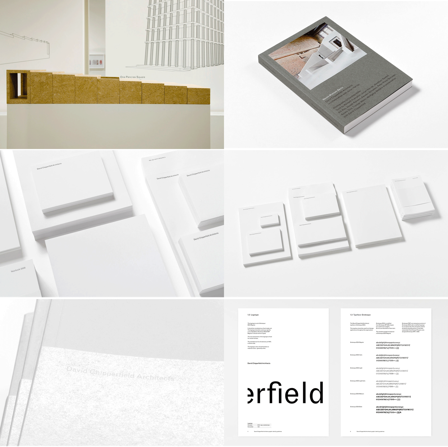
John Morgan has branded a city and typeset the words of God. He has set poetry in granite and written a brand book (for David Chipperfield Architects) that begins: ‘The first guideline is to work with a good designer.’ He designs books that are beautiful and desirable objects, good to hold and own and use, yet most of his time is spent thinking about the meaning of words and of characters and the spaces in between. He once took a graphic design vow of chastity (‘The designer must not be credited’), yet his work is wide-ranging and polymorphous, adding dignity to books and business cards, bringing gravitas to criticism in academic journals and fine art captions.
For those of us immersed in a world of unsubtle, overwrought design, Morgan’s work can be so subtle and understated that it catches you out. Look at his design for Drawing the Curtain: The Cold War in Cartoons (Fontanka, 2012). It’s not just the typography that makes this big book so inviting, it’s the way the images have been paced and ordered to support the authors’ ideas and intentions. Also, it’s the way the book feels in your hands, the way the pages turn and lie flat while you are reading text or examining the pictures. Morgan’s design is there at your side while you read the book, helping you to enjoy every aspect of its contents, but performing this role so skilfully that you almost forget he’s there.
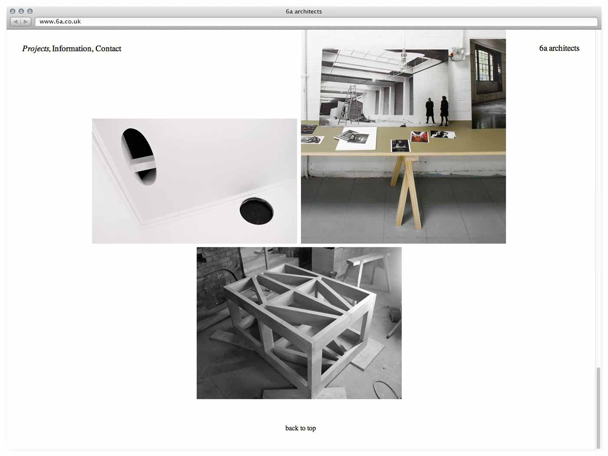
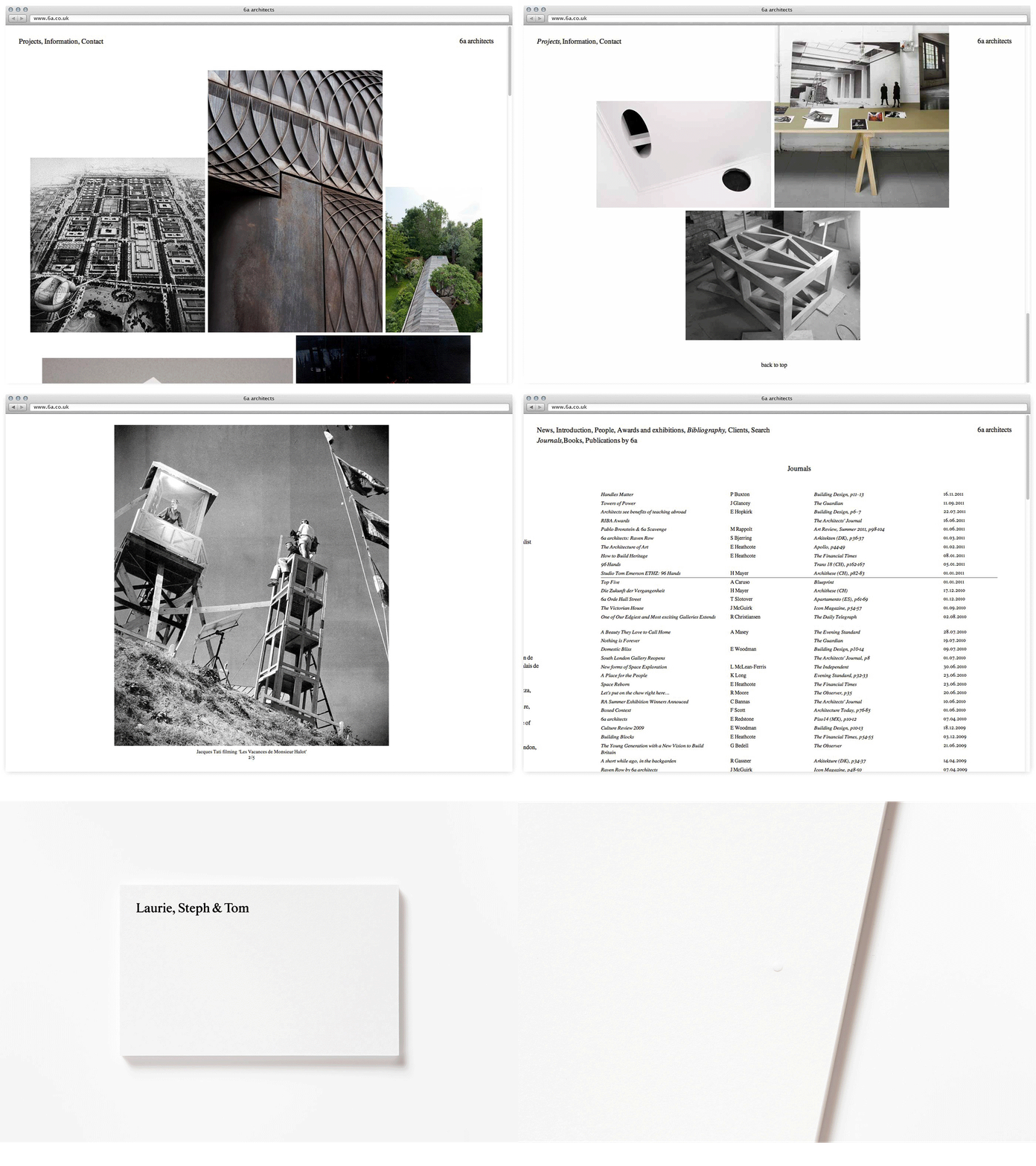
Look, too, at 6a.co.uk, his minimal website for 6a architects (a vertically scrolling selection of images whose seriffed captions appear when the user mouses over the frame), or the simplicity of his design for Things 19-20, whose monastic greyness, wrapped in a yellow cover, stands out in a jungle of text heavy journals as both serious and readable.
For Morgan, the devil is in the detail, typographic or otherwise: ‘There’s rarely an archetypal design solution,’ he says. ‘I do think I could redesign something for ever, and often do.’ Every choice, he explains with a long sigh, is so loaded: ‘I want a typeface which is of my time, which is relevant now, but I want to design for the long term. And even an ephemeral thing can stay around for the long term!’
But there’s a wilder side to Morgan you see in his work for Raven Row gallery and Ambit magazine – the deliberate artlessness of his vernacular signs, the translucent pink plastic cover for The Jet Age Compendium: Paolozzi at Ambit, and the way he cheerfully plonks smudgy scans of book and magazine pages alongside his own typography in AA Files and the eccentric Four Corners Books edition of The Picture of Dorian Gray.
Could there be an almost gothic, Dr Jekyll / Mr Hyde element to Morgan’s design practice: serious Reading-trained book typographer by day / wild art director by night?
Morgan sees the two sides as completely complementary, both in his work as a graphic designer, and in his approach to teaching.
‘There was a period when I taught at Central Saint Martins (CSM) and the University of Reading at the same time, and I saw my role and position as opposites. But you respond to the environment and see what’s needed. The CSM students were well looked after in grand gestures, so I taught detailed telephone directory layout. At Reading, there wasn’t much (dare I say it?) “atmosphere”, so I pointed the students in that direction. Horses for courses.
‘I like students to be able to produce the detail of Jan Tschichold or Hans Schmoller [Tschichold’s successor at Penguin] combined with the overview of books or posters by [German artists] Martin Kippenberger or Hans-Peter Feldmann.’
Morgan says he has learnt much from working with architects, particularly Chipperfield, and the scale at which they operate: ‘For large-scale projects such as signage or identities where you are working with many people, you have to accept a degree of what David Chipperfield would call “critical compliance”. You cannot control every detail, so you become a consultant – sometimes even to your own studio.’
Chipperfield, by contrast, values the fact that Morgan’s team is small. ‘In my business … to put a building together I need fifteen people,’ he says during a phone interview. ‘But there are “surgical” moments, when someone has to give direction, to clarify the proposition. When you work with John you’re working with John – there is no substitute. What he does is very precise.’
Morgan frets about the content, the validity of producing many of the projects he is asked to do. Does anyone need large photobooks any more? What is the relevance of large art catalogues when it is easier to search online? Morgan’s designs for Phillips de Pury answer this question well; his subtle catalogue design gives the auction house a critical edge in a difficult marketplace.
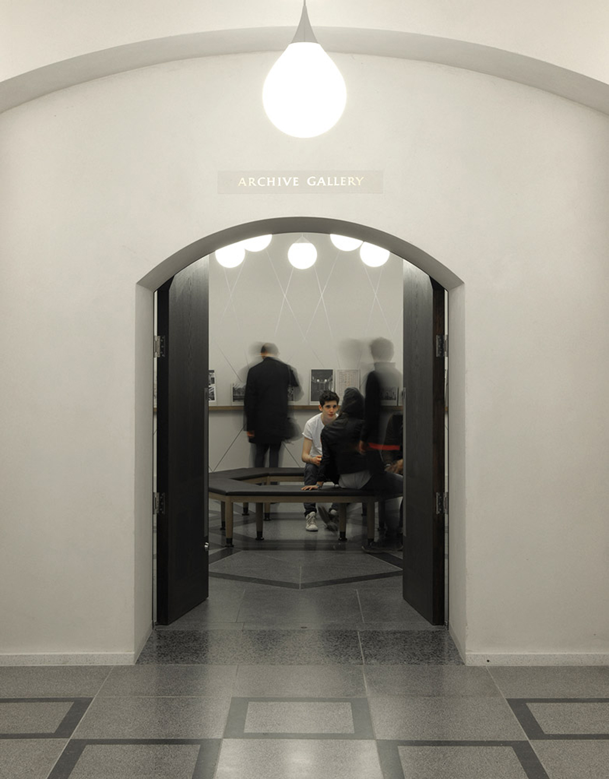
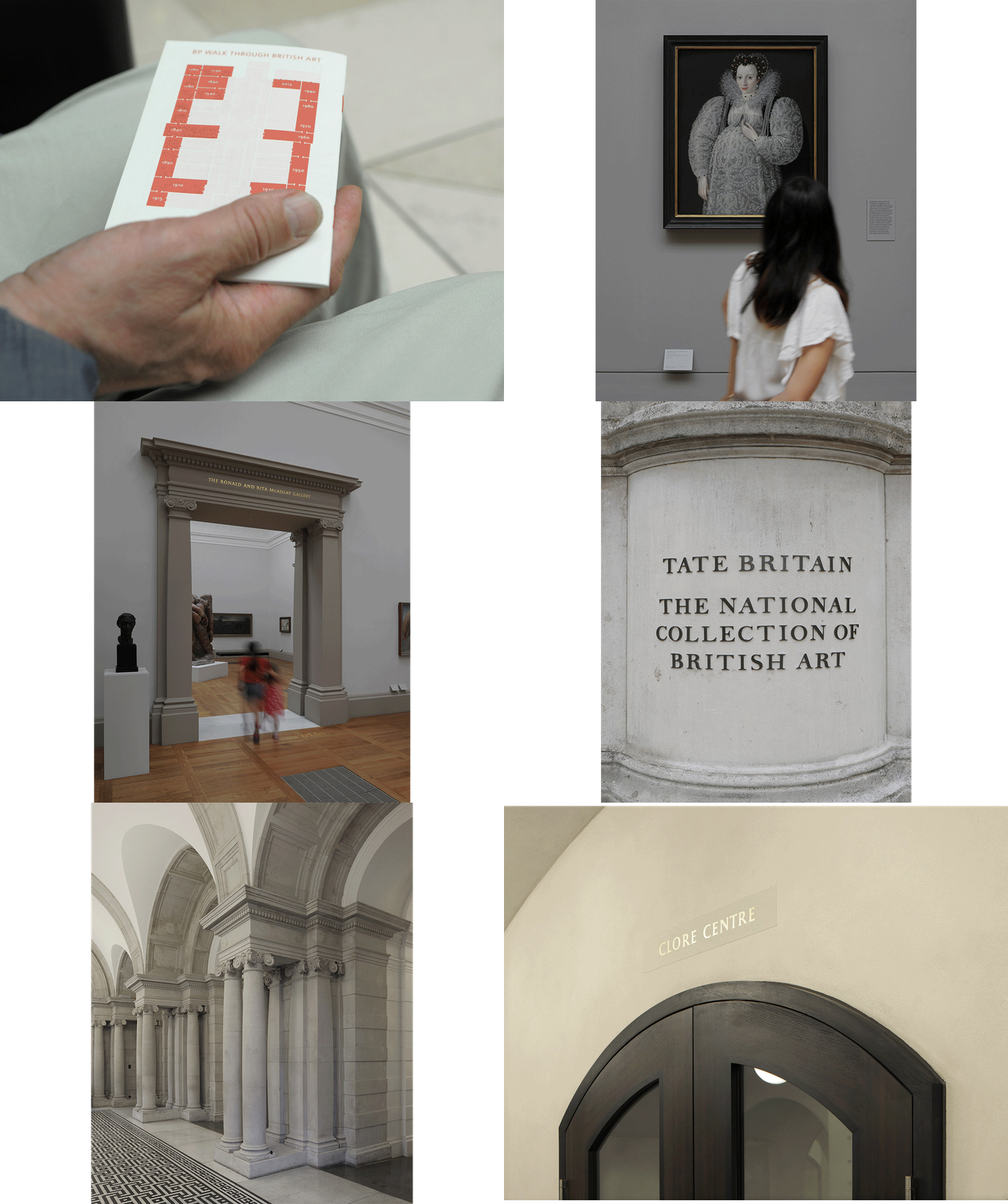
Are all these art gallery signs really necessary when the reception desk and shop are perfectly visible and readable without superfluous typography? ‘You can argue yourself out of a job,’ he says with a grimace.
In our first conversation for this article, in a café near his London studio, the matter most pressing on Morgan’s mind is the correct word to describe the totality of a piece of typographic work. Could that word really be ‘atmosphere’? He can’t help returning to that troublesome term throughout our conversation. Morgan works with artists, architects and curators all the time, people who work with expansive, expensive-sounding phrases.
‘[Swiss architect] Peter Zumthor doesn’t hesitate to use a word like “atmosphere”,’ he says. ‘Atmosphere is a problematic and woolly word, but it’s the best description of what I aim for in my work. It’s the sensation you find when you walk into a building or space and it changes the way you feel.
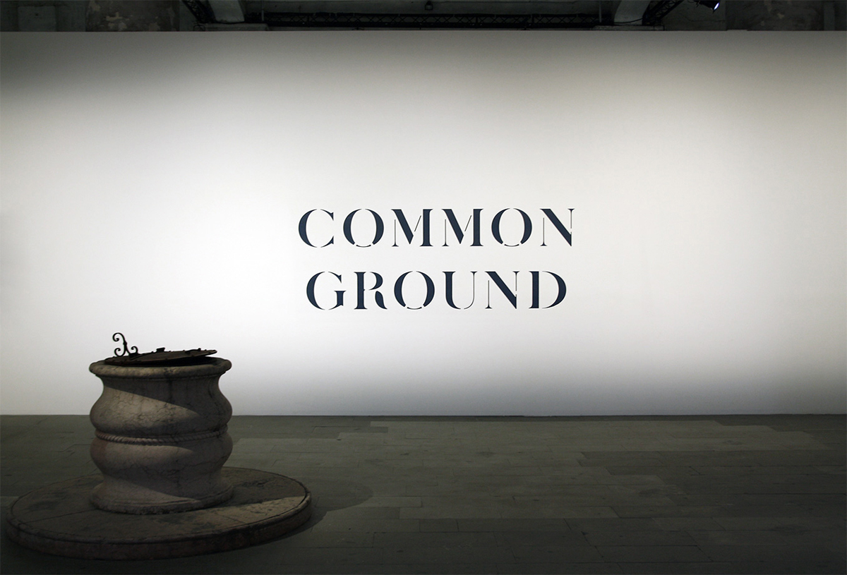
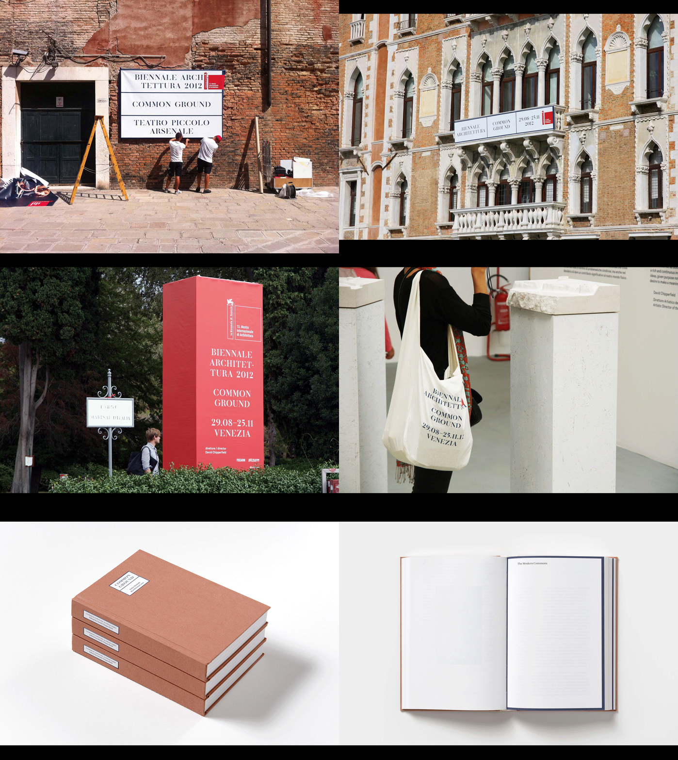
Venice Architecture Biennale 2012
Graphic identity, exhibition graphics, posters, environmental graphics, books, merchandise. 2012
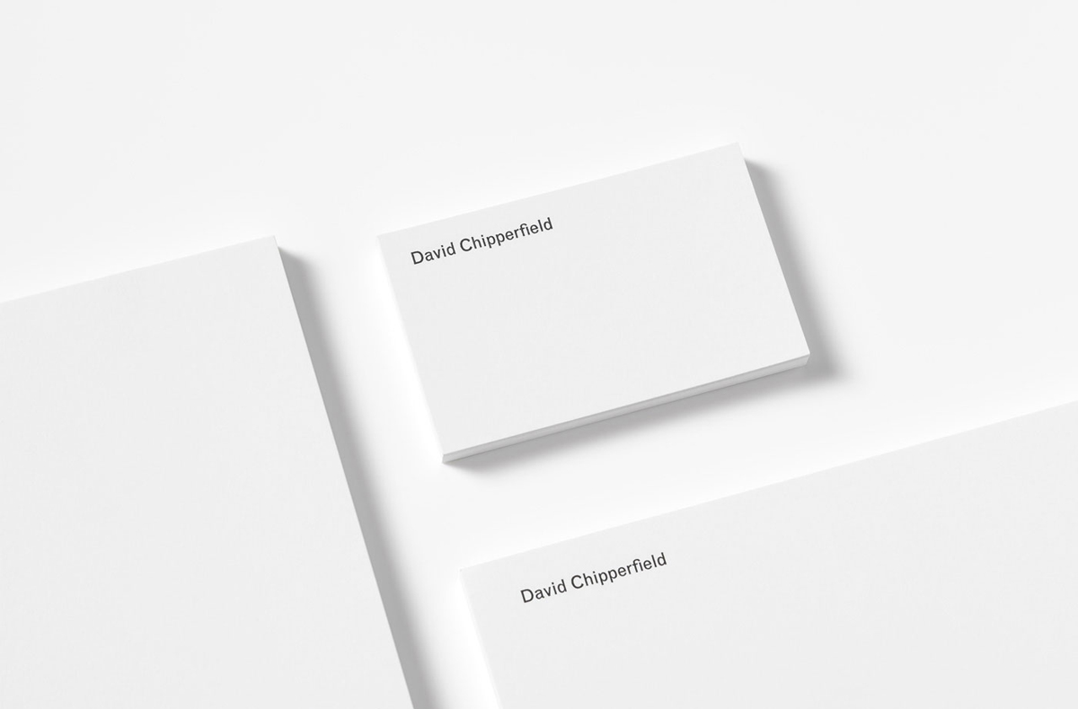
David Chipperfield Architects
2008–ongoing
Tate Britian
Signage and wayfinding with Ian Whybrow. 2013–15
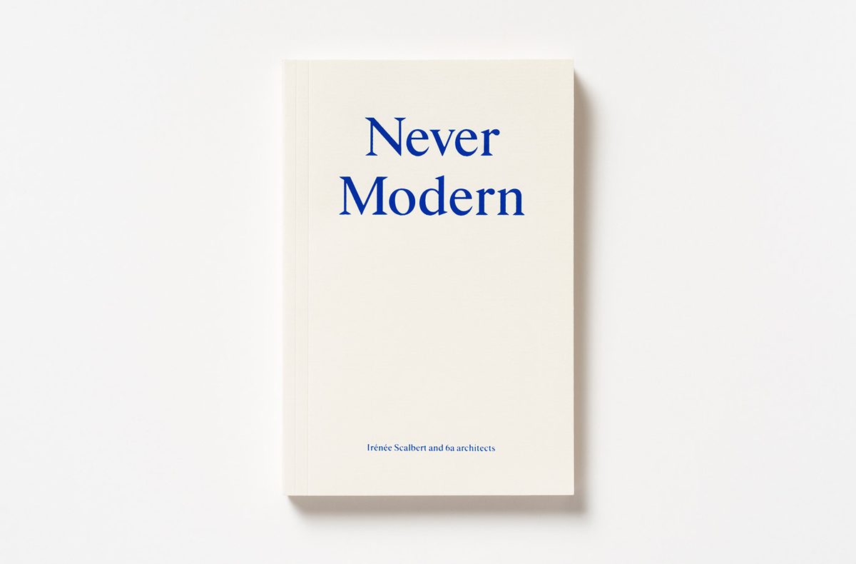
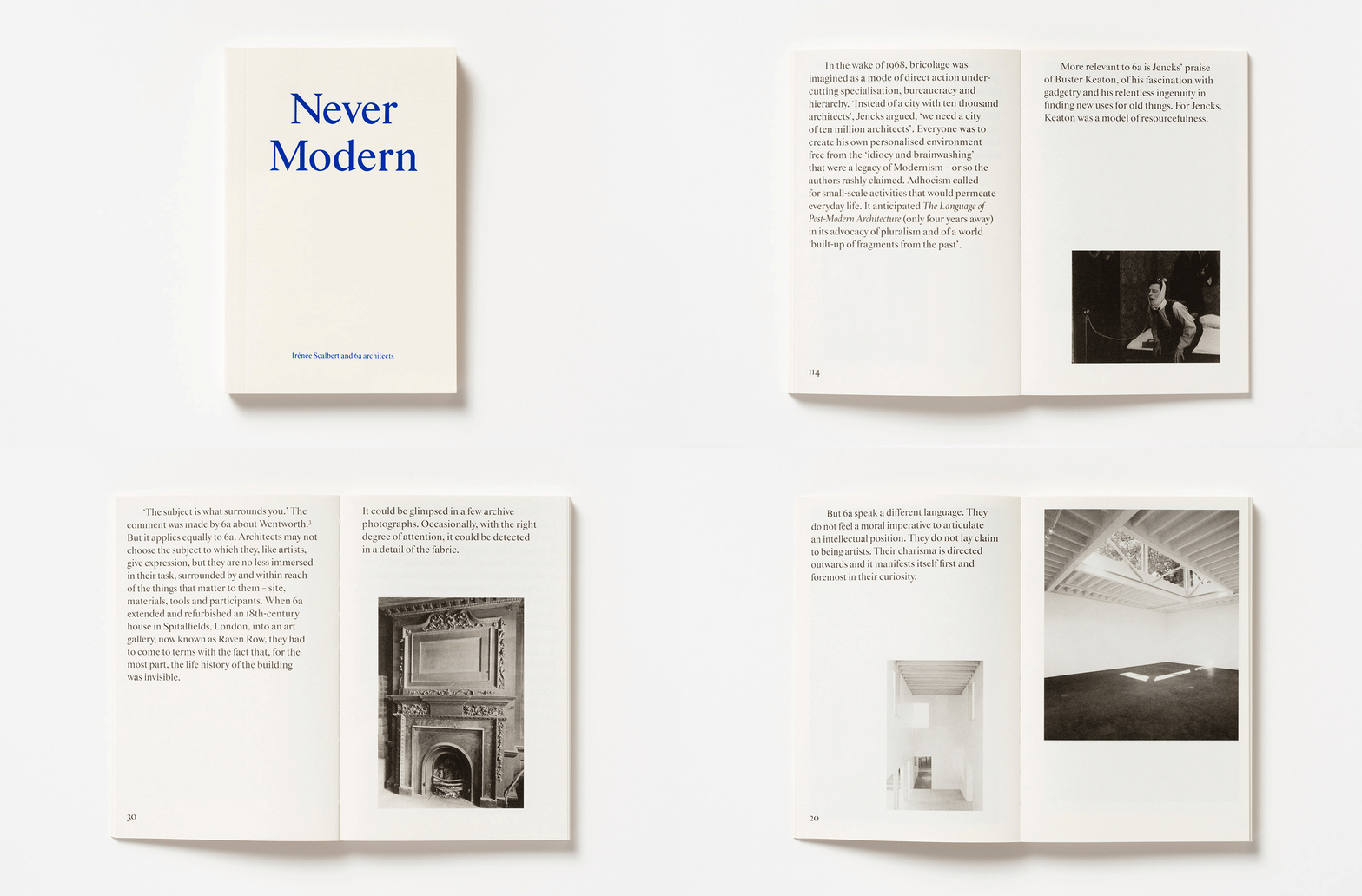
6a, Never Modern
By Irénée Scalbert and 6a architects. Park Books, Zurich. 2013
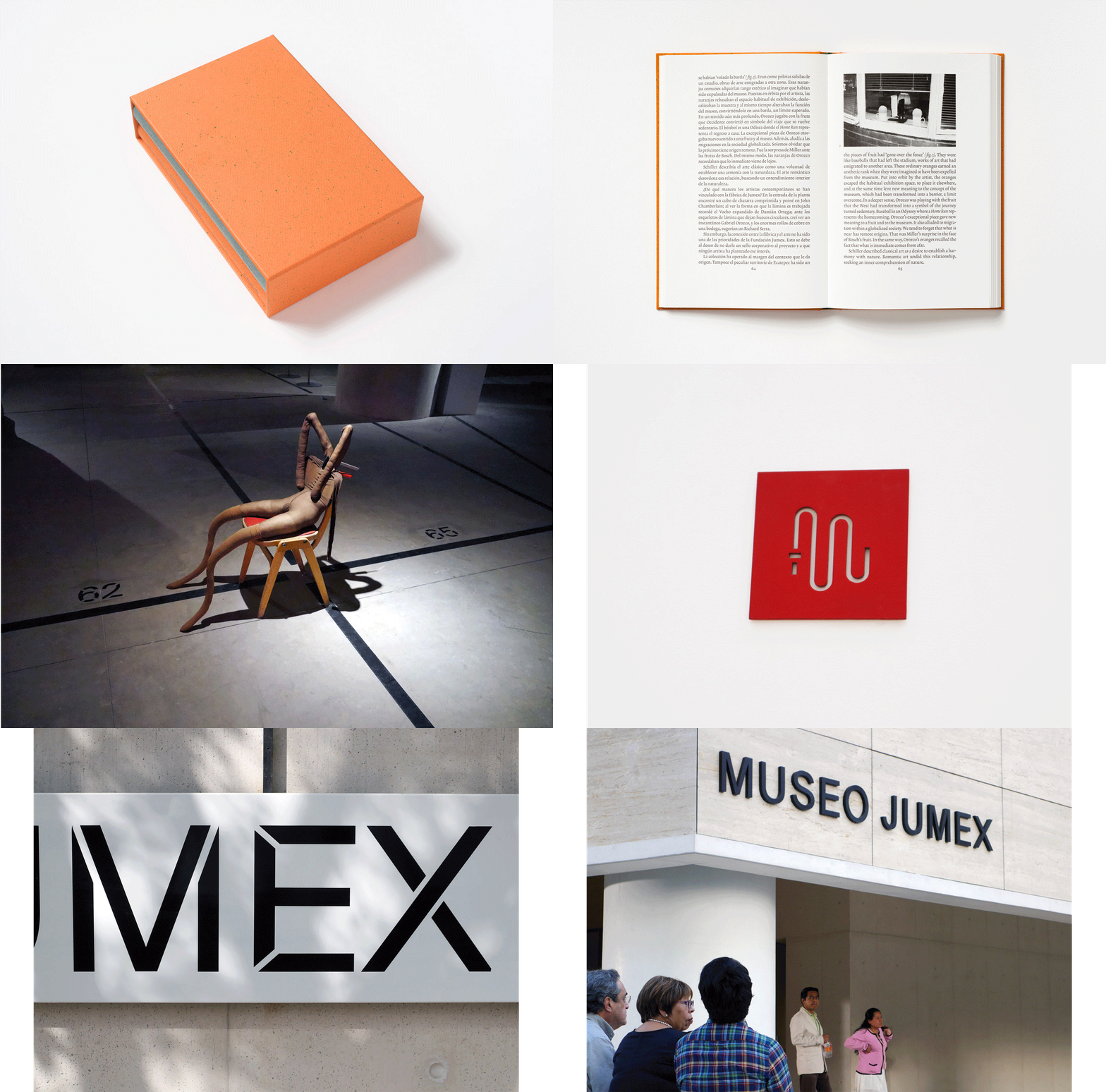
Museo Jumex
Mexico City. 2013
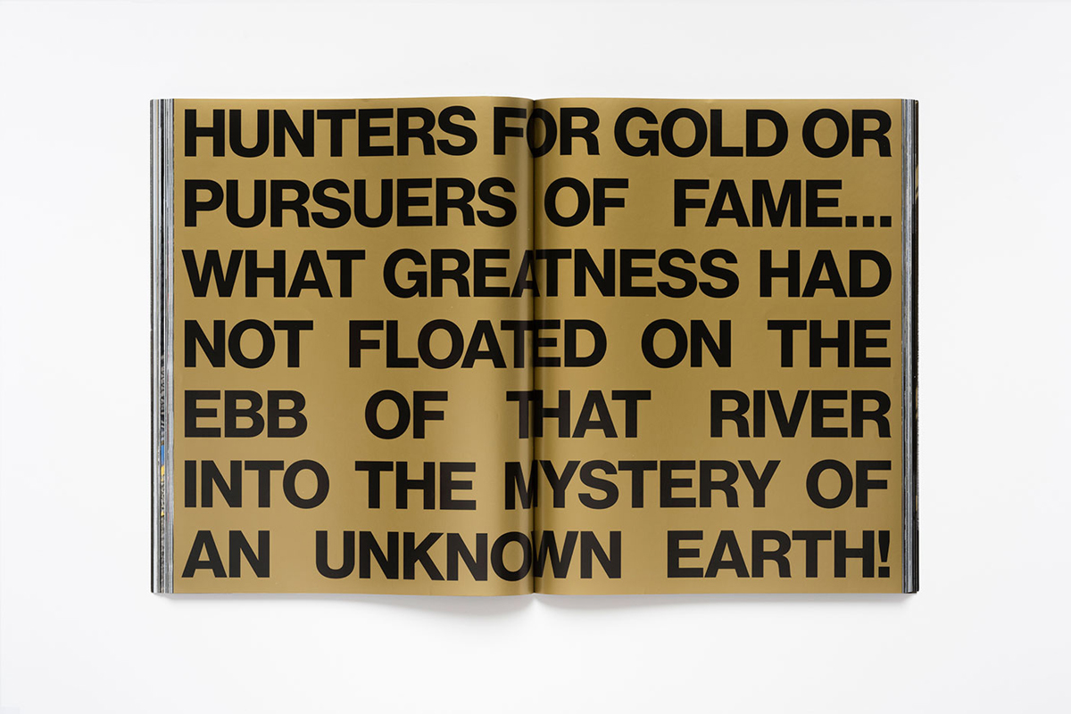
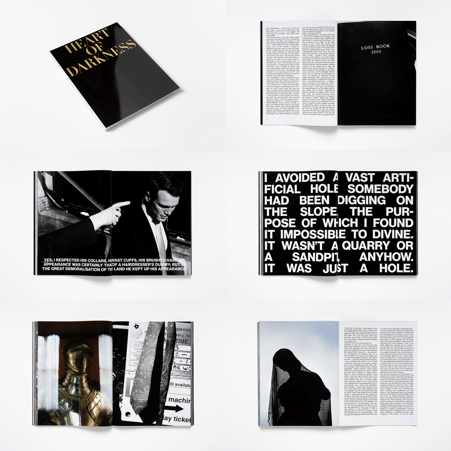
Heart of Darkness
Words by Joseph Conrad. A Work by Fiona Banner with photographs by Paolo Pellegrin. Four Corners Books. Co-published with The Vanity Press. 2015
6a Architects
Programming by Studio Scasascia. 2010–ongoing
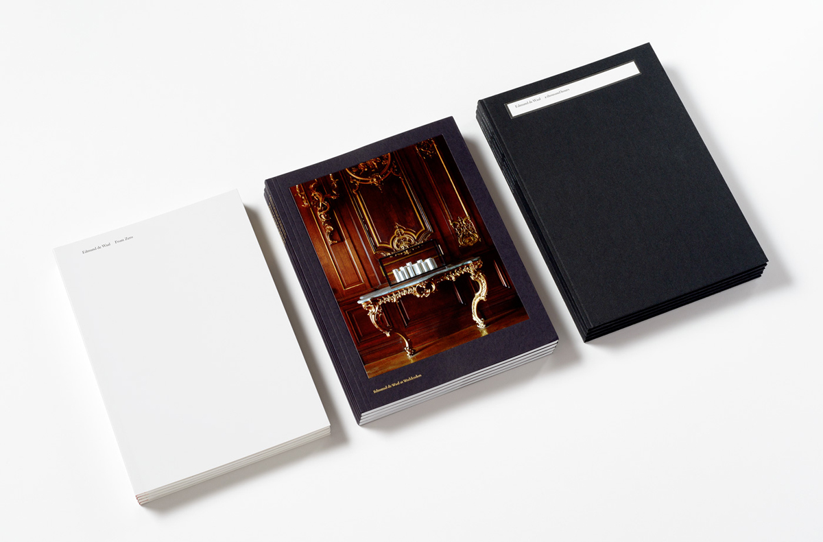
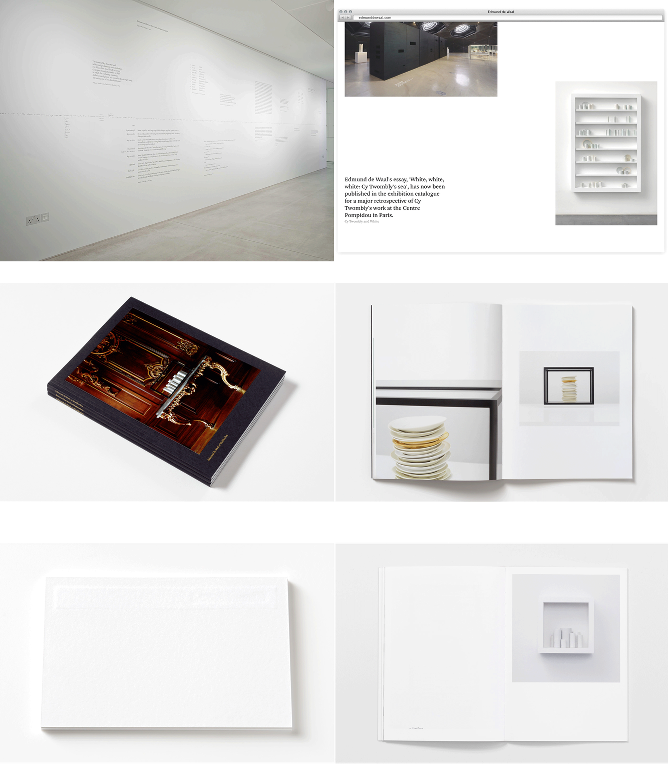
Edmund de Waal
2010–ongoing
Esta entrada aparece primero en HIC Arquitectura http://hicarquitectura.com/2017/10/morgan-studio-graphic-designer/

No hay comentarios:
Publicar un comentario