Font: Pau Bajet Mena, Maria Giramé Aumatell
Photography: José Hevia
The architecture
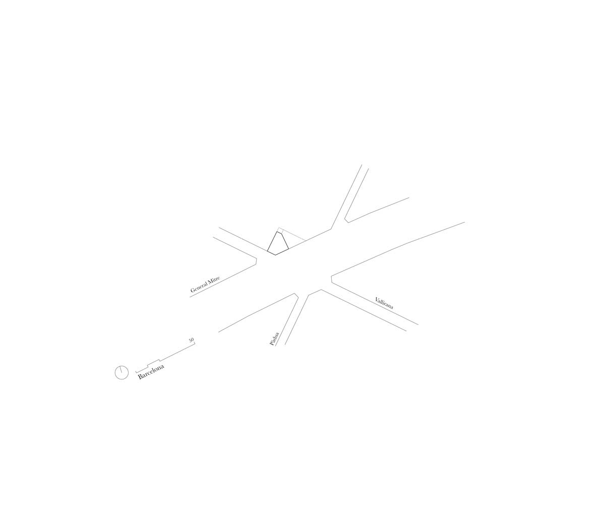
The project consists of remaking a home in a 1970’s apartment in Barcelona.
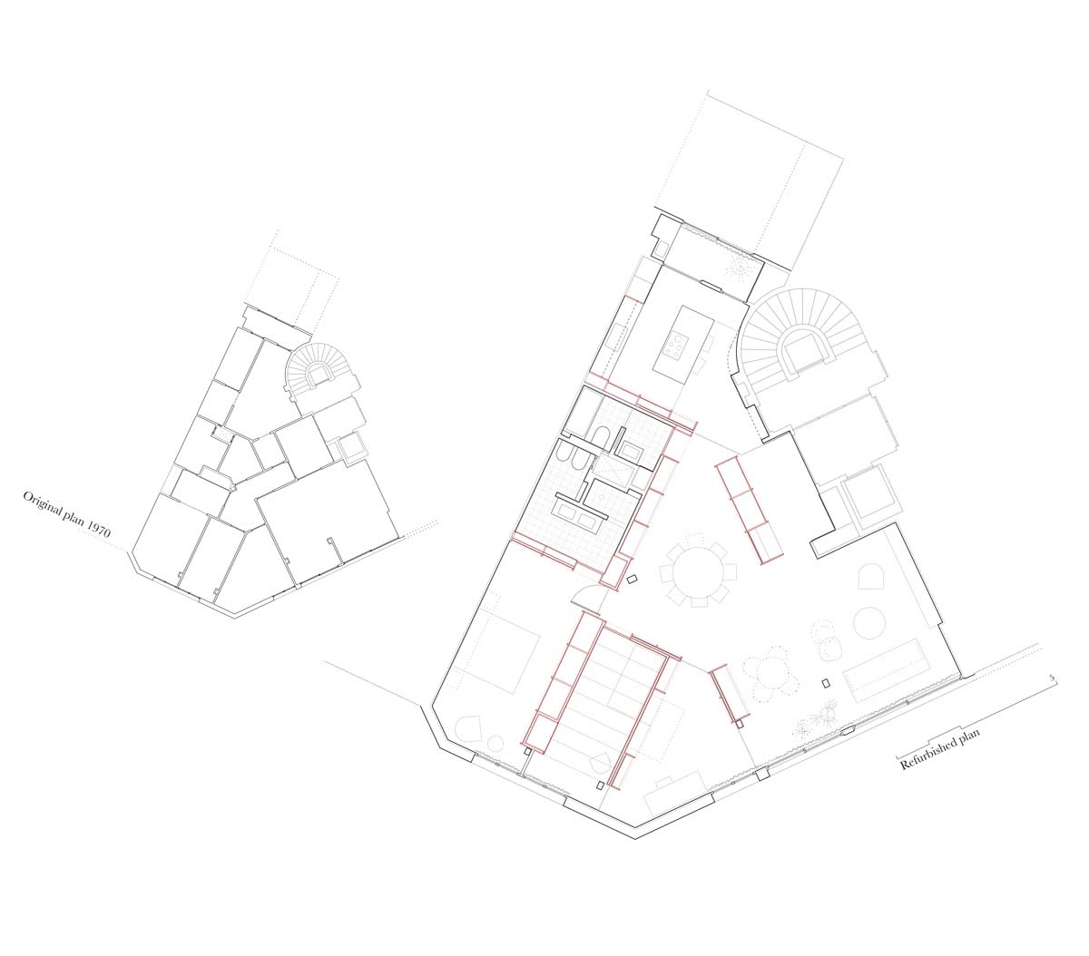
The former spaces were based on program requirements resulting in a series of small rooms and corridors with predefined functions. Those spaces were shaped by non-load bearing walls given its ‘properly modern‘ free plan.
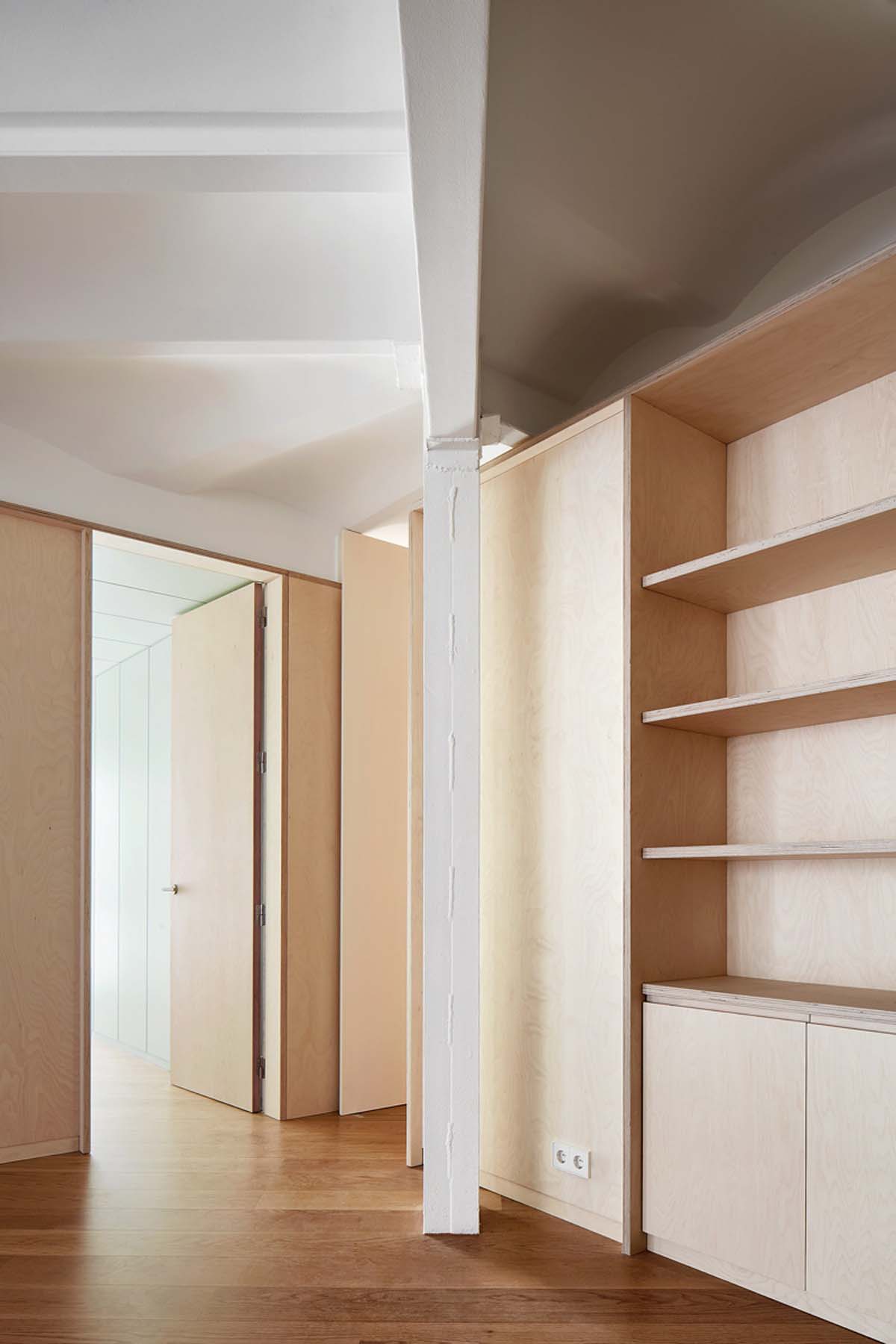
However, columns, beams and slabs were concealed within the internal partitions as shameful bones.
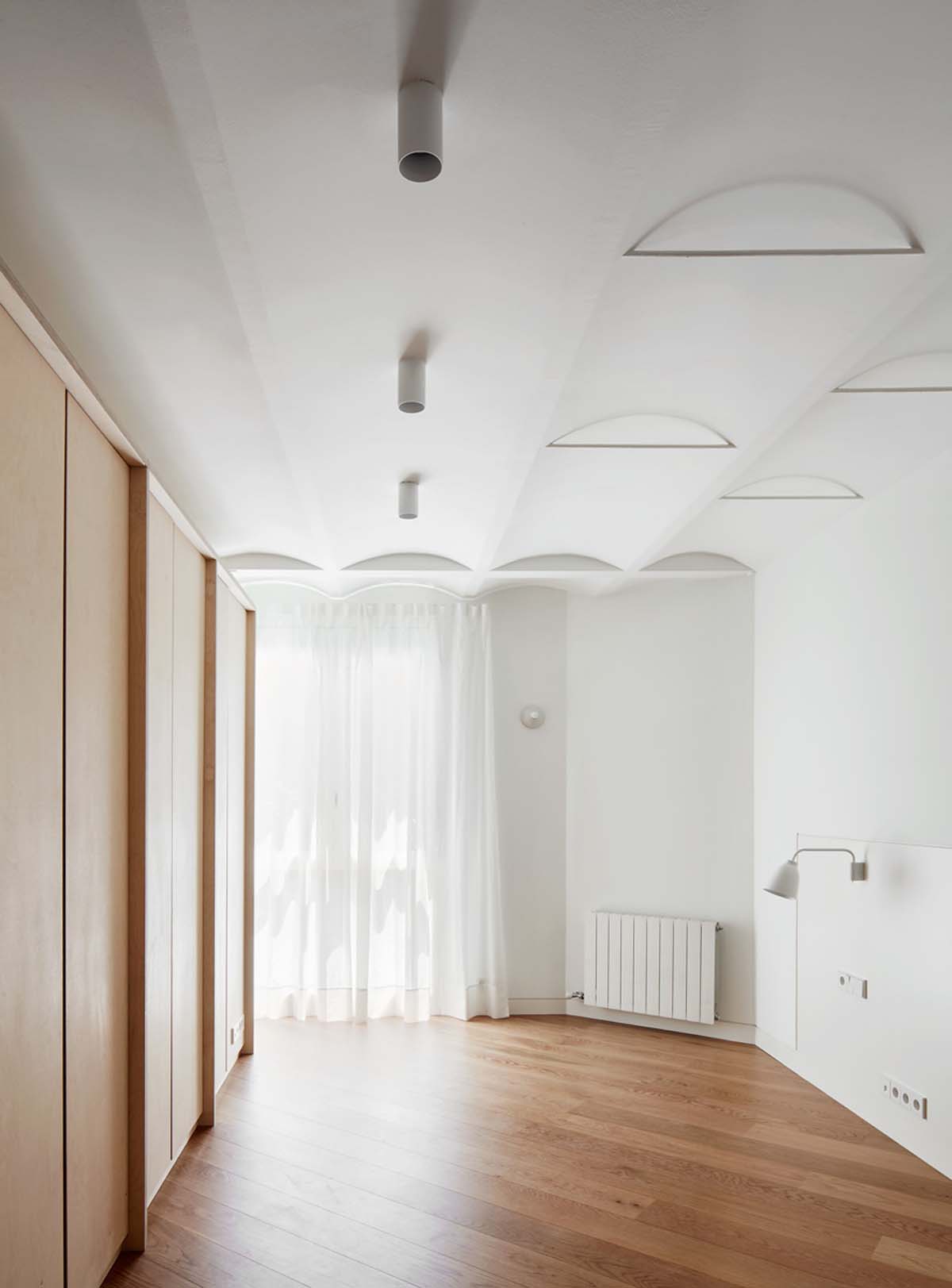
The aim of the project was to make the apartment again (remake it), with significant setting and character changes. This would be achieved two-fold: by unveiling the hidden qualities of the 70’s architecture and by defining a new series of suggestive settings.
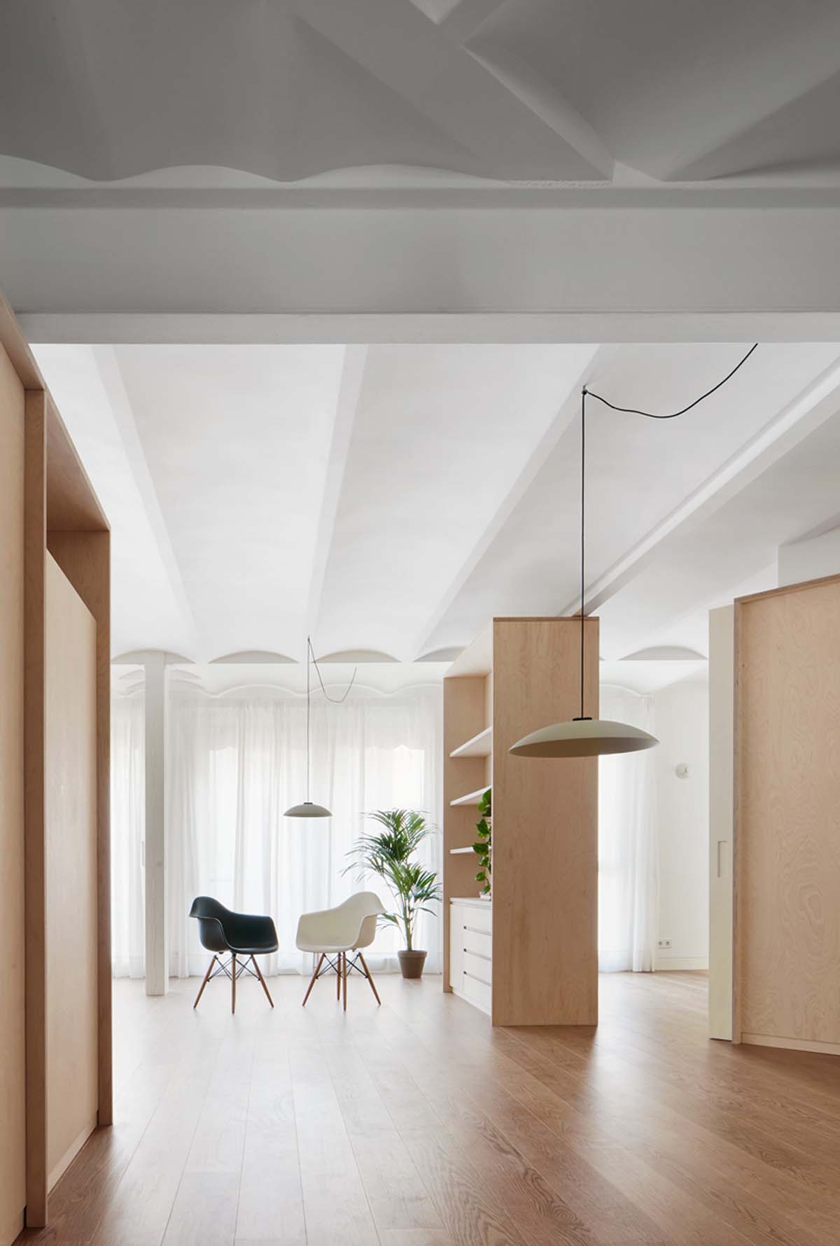
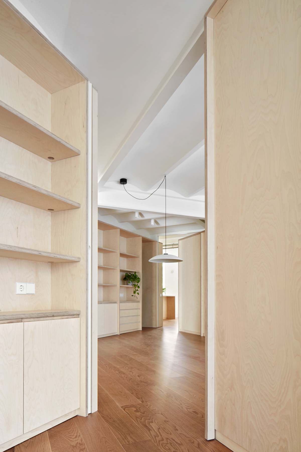
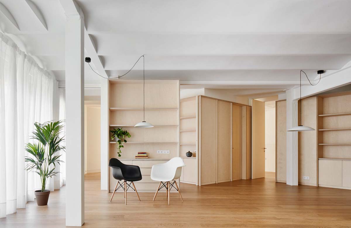
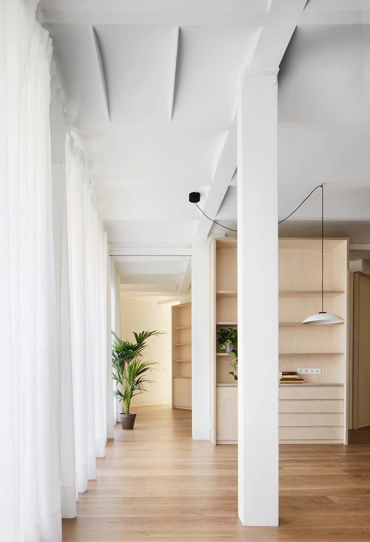
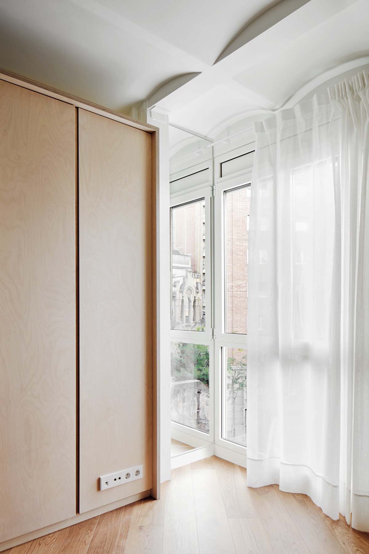
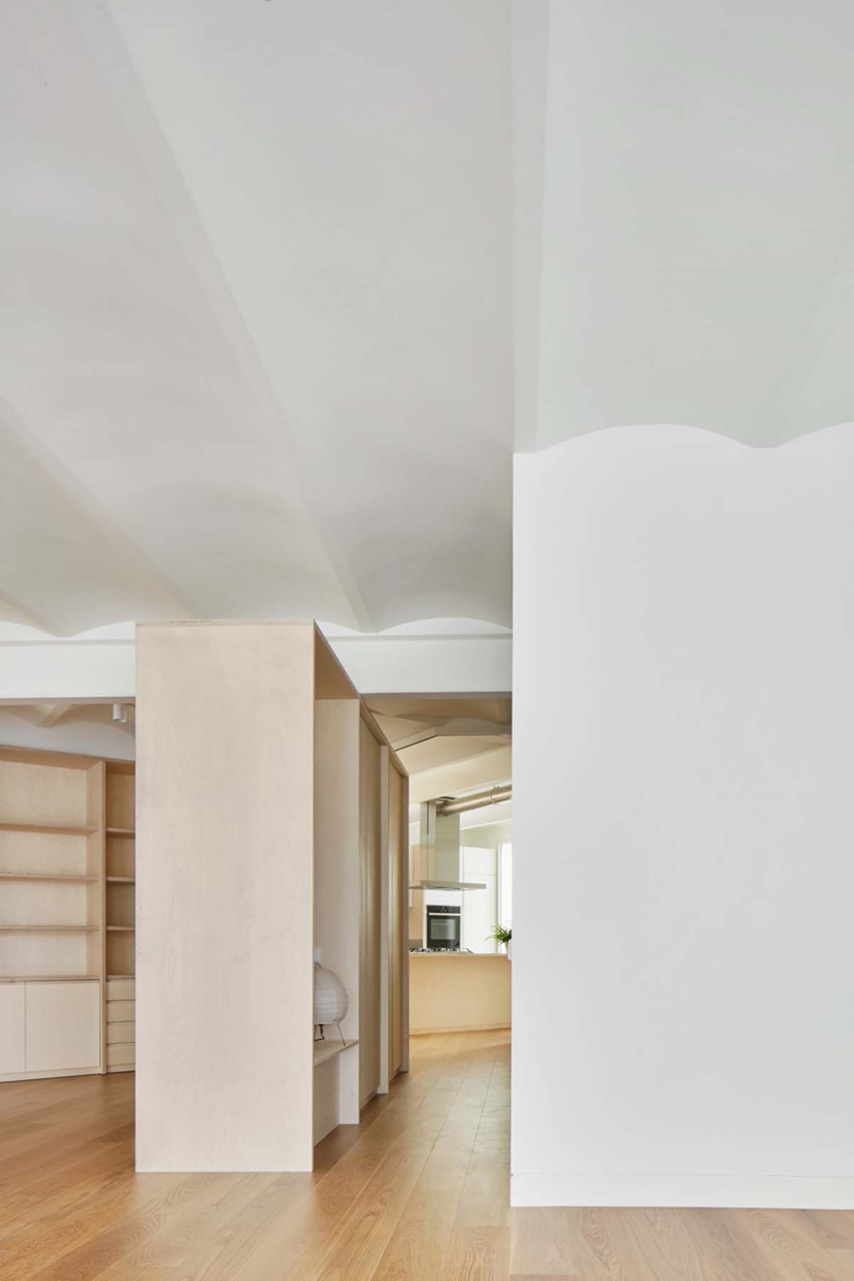
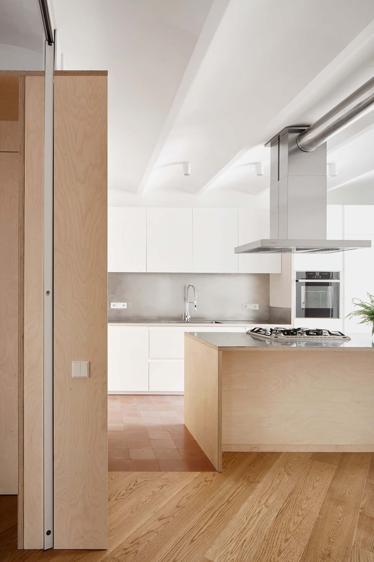
The project endows the former idea of free plan, but exposes it ‘as found’ leaving its (‘modern’) steel columns and beams freestanding with their rough welds, as well as uncovering the (traditional) gentle ceiling vaults; enhancing very specific qualities of the construction means of those 1970’s in Barcelona. This way an ‘infrastructural space’ is defined, as a permanent envelope in which smaller and temporary interventions will arrange ‘inhabitable settings’. A series of timber pieces are displayed within that envelope stressing the divorce between space and structure. Their shape, size and material qualities suggest places to be lived-in, from the sheltered interior of a panelled room to the gathering central space of the house.
The story
This had been their place for the last 30 years. They used to live here with their children, though it’s been few years since the youngest one left. They were living alone with many empty small rooms still laid out as sons’ bedrooms. It was the typical flat from Sant Gervasi: 3 bedrooms, 2 bathrooms, flat ceilings, decent reception room with timber flooring, long corridors and separate maid-area with kitchen, bedroom, lavatory and service entrance. He enjoys cooking, but that dark kitchen was never thought for him to cook. The apartment was double-orientated: to the street (south) with large façade and generous windows and to the rear garden (north), however the internal maze of corridors and rooms prevented any sense of orientation and natural light to go through. They needed to remake their place.
They recently got retired and spend more time at home. The space now crosses diagonally the house bringing the sunlight from one end to the other.
He can see the street from the kitchen. She enjoys the unexpected walkways along the façade and around the large timber cabinets. The house feels much broader. The sight finds no end. They have a small panelled guest room for their grandchildren. There is another space where they have a desk and a sofa bed. They now appreciate the beauty of the triangular shape of the space, they understand the sequence of smaller and larger settings that their life occupies; they have a sense of orientation, a sense of place.

bg_home in mitre from Bajet Giramé on Vimeo.
Location:
General Mitre, Barcelona
Net floor area:
140m2
Project date:
2015-2016
Cost:
1000€/m2
Architect:
Bajet Giramé (Pau Bajet Mena, Maria Giramé Aumatell)
Contractor:
GID
Collaborators:
Gina Cebamanos
Huguet Mallorca
Imar
Ardèvol Associats
Esta entrada aparece primero en HIC Arquitectura http://hicarquitectura.com/2017/12/bajet-girame-home-in-mitre/





No hay comentarios:
Publicar un comentario