Source: David Leech Architects
Photography: David Leech Architects
The character of this modest garden extension is created from the expression of a simple structural construction.
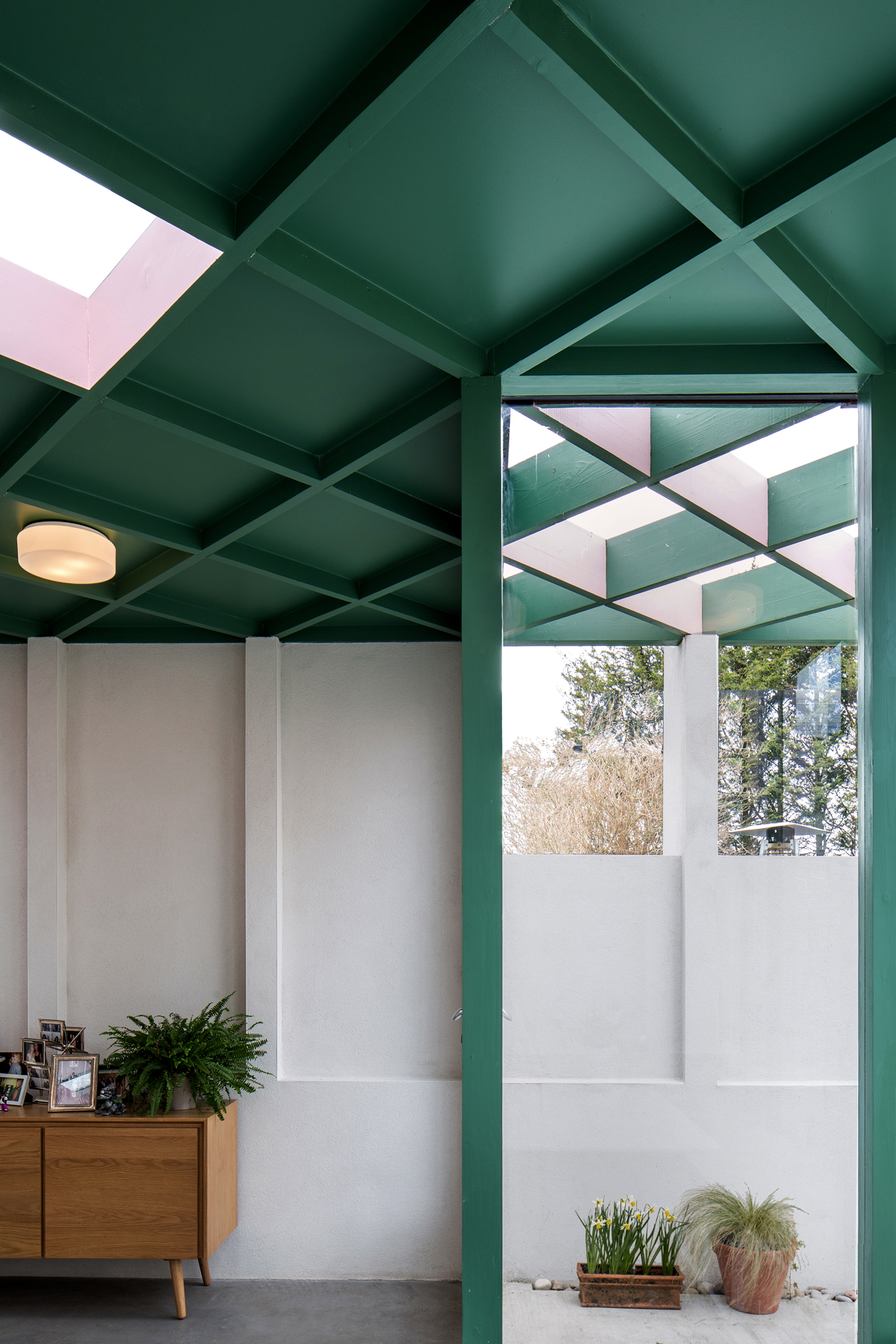
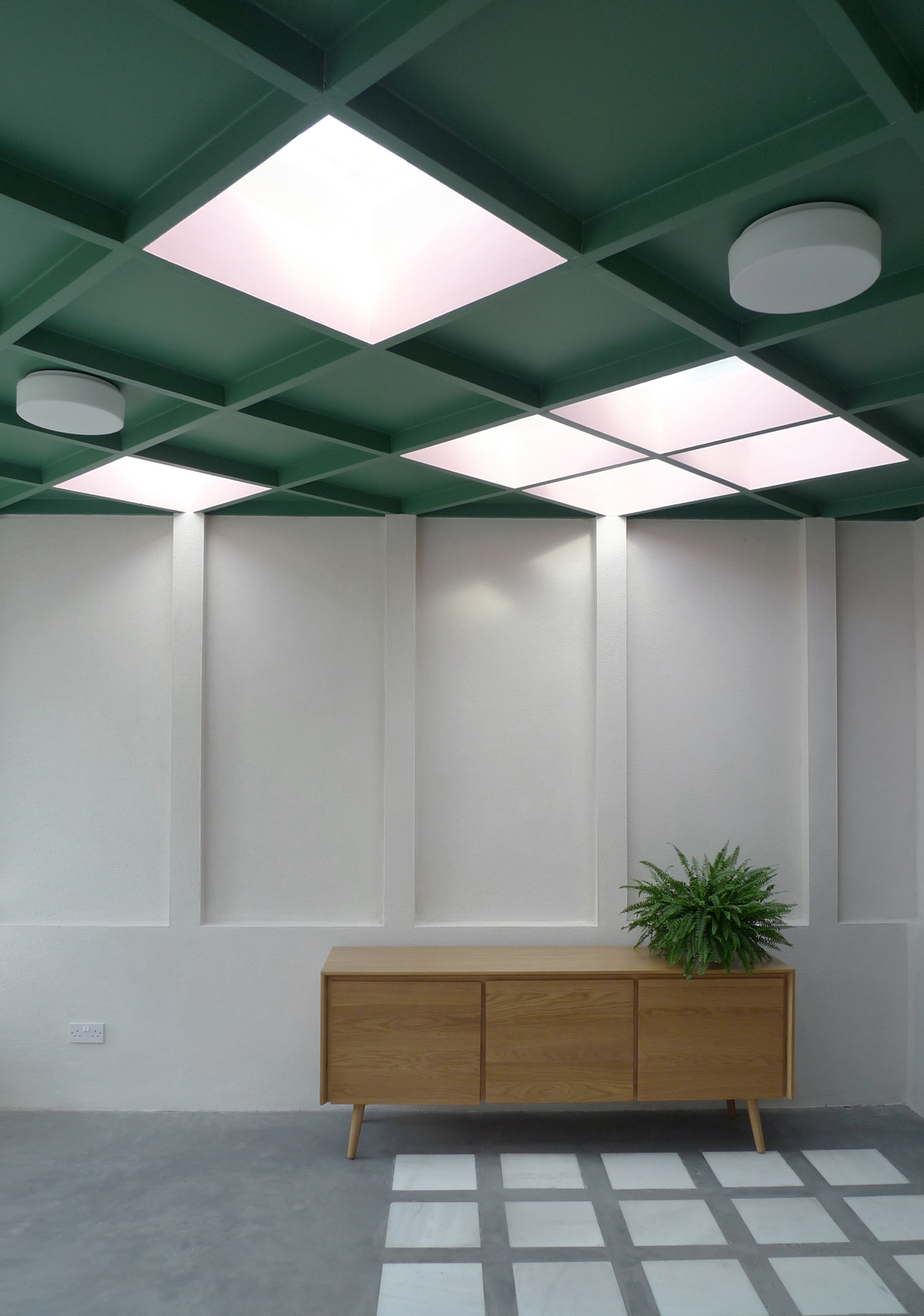
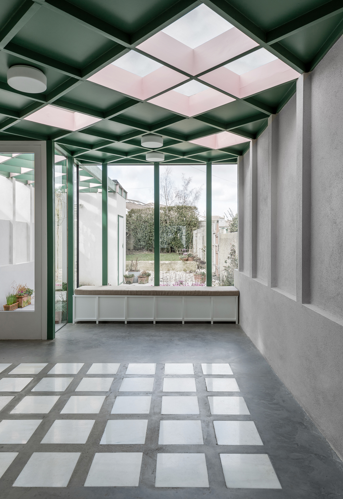
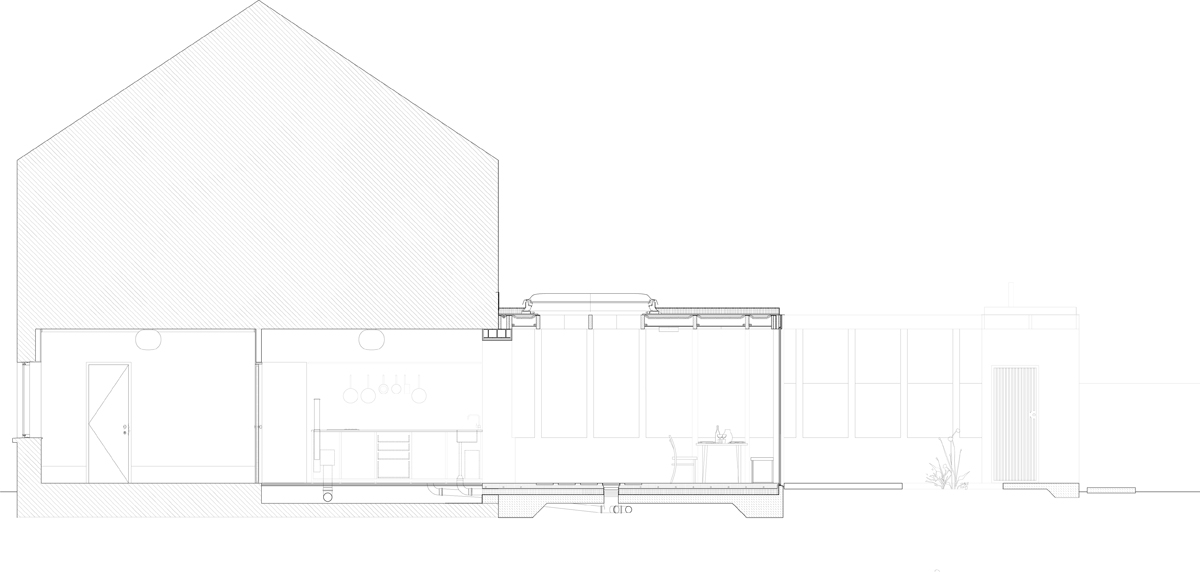
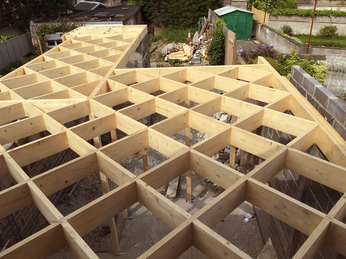
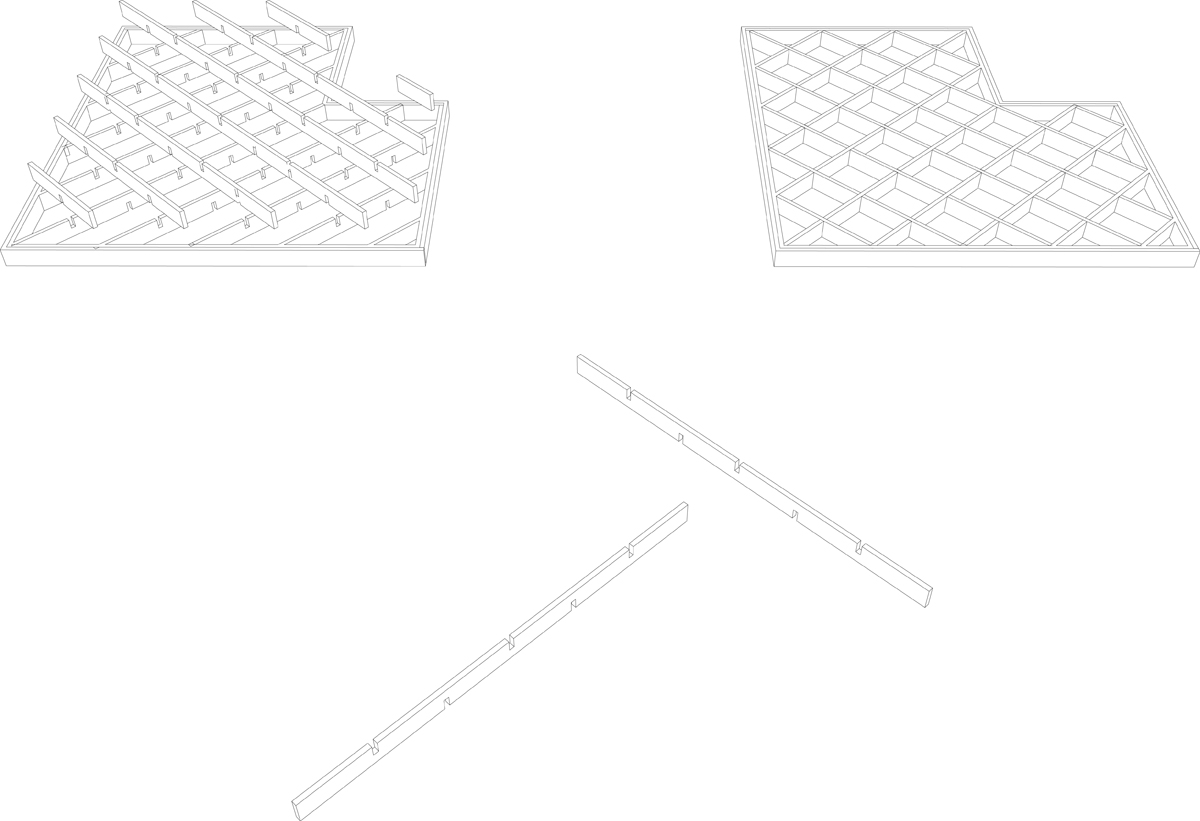
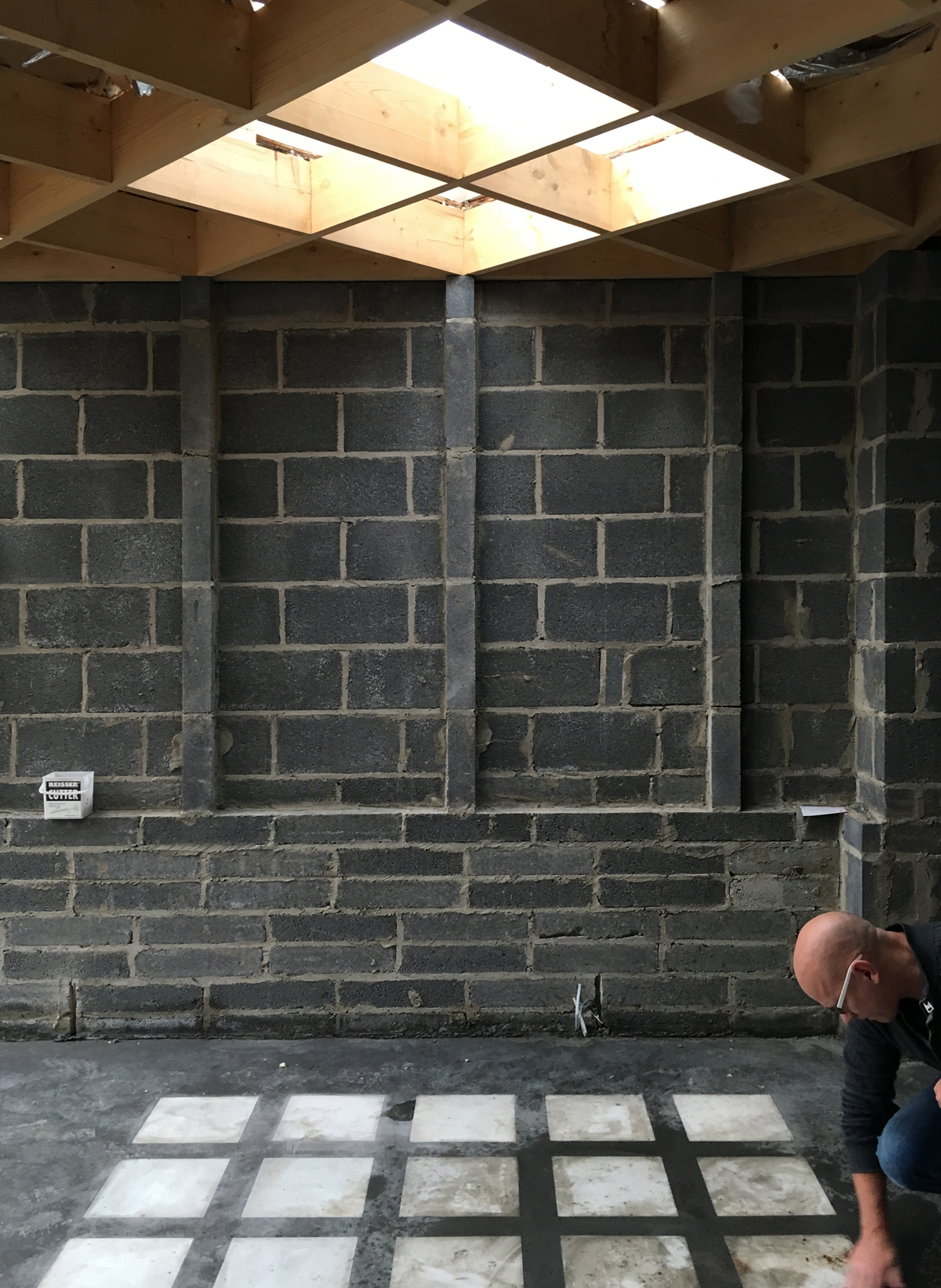
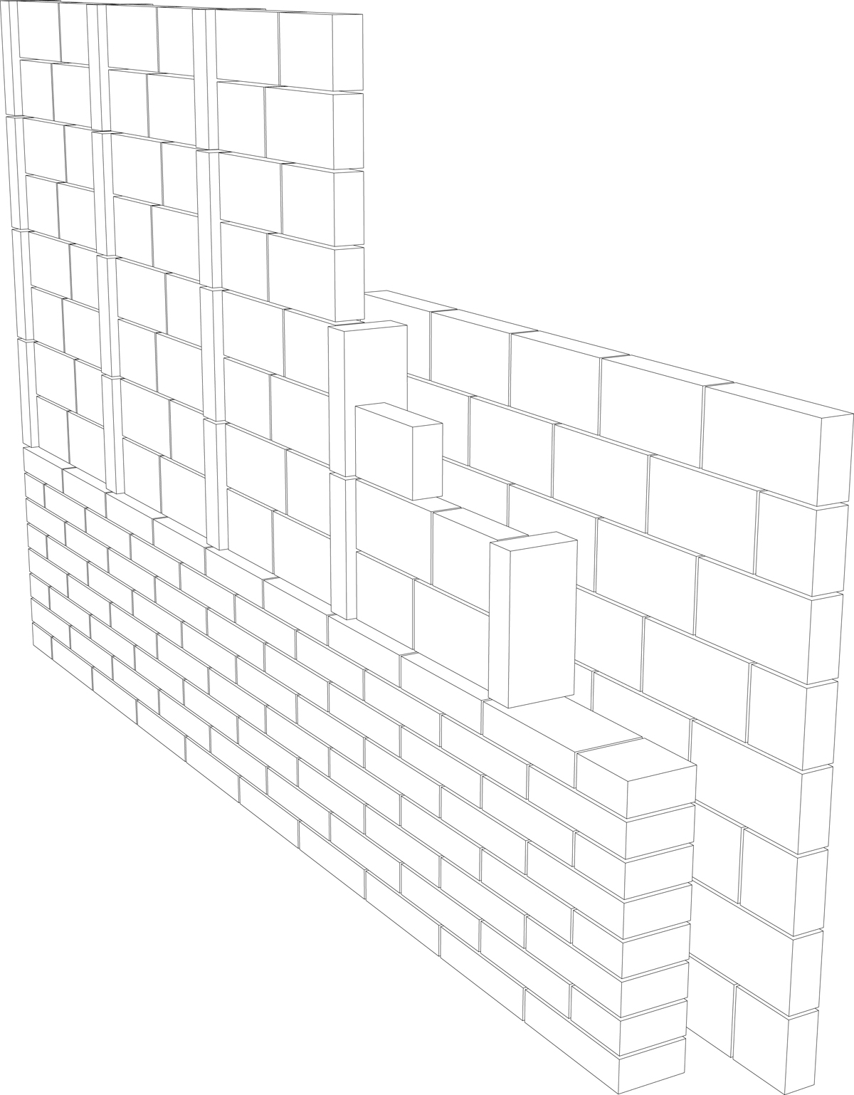
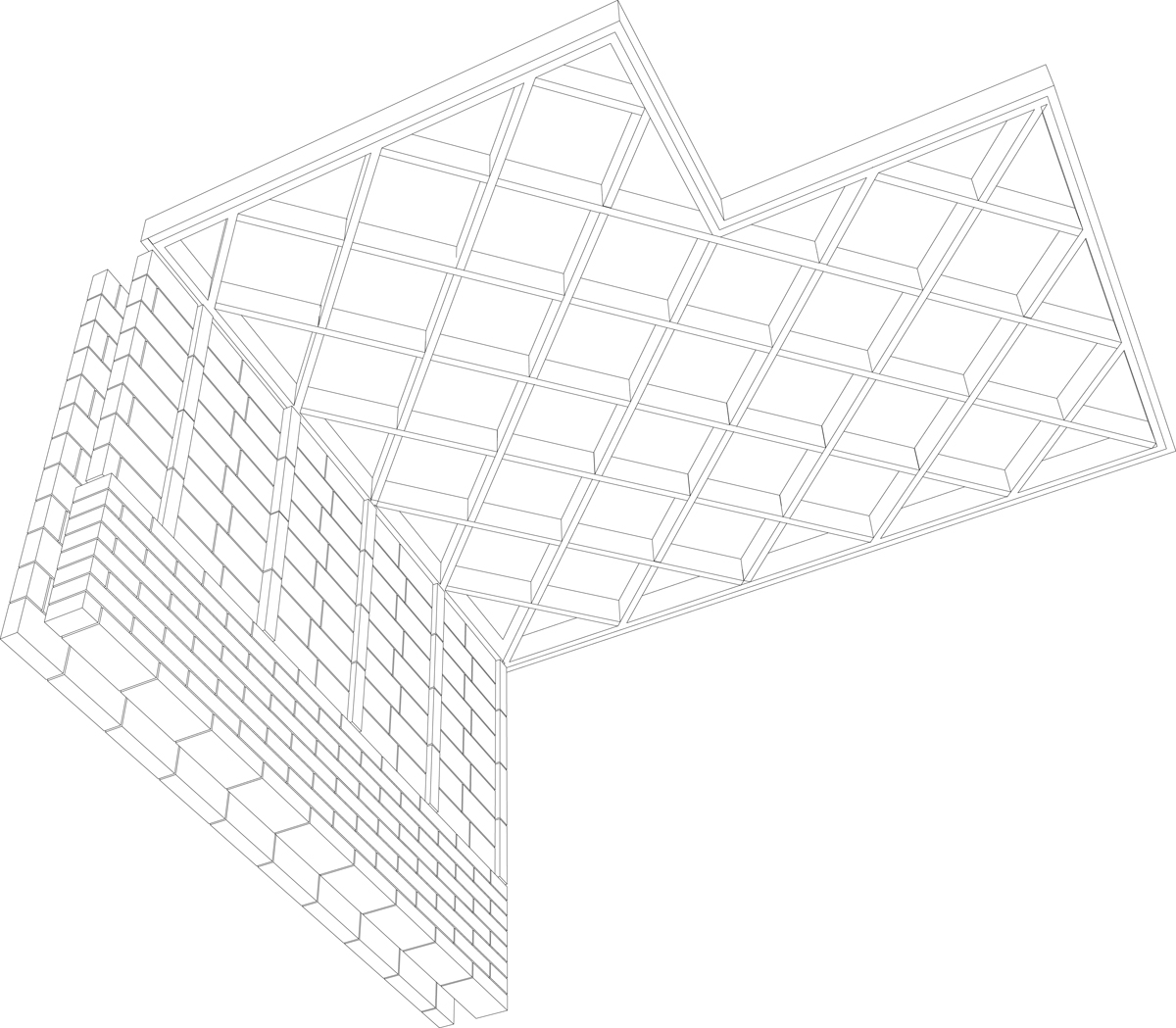
Standard timber joists, at 600mm spacings, cross in both directions to allow for a free span between 2 rendered blockwork cavity walls. The timber beams sit on shallow pilasters formed where the blockwork is turned through 90 degrees to provide laterally restraint and to give a subtle relief to the bearing walls.
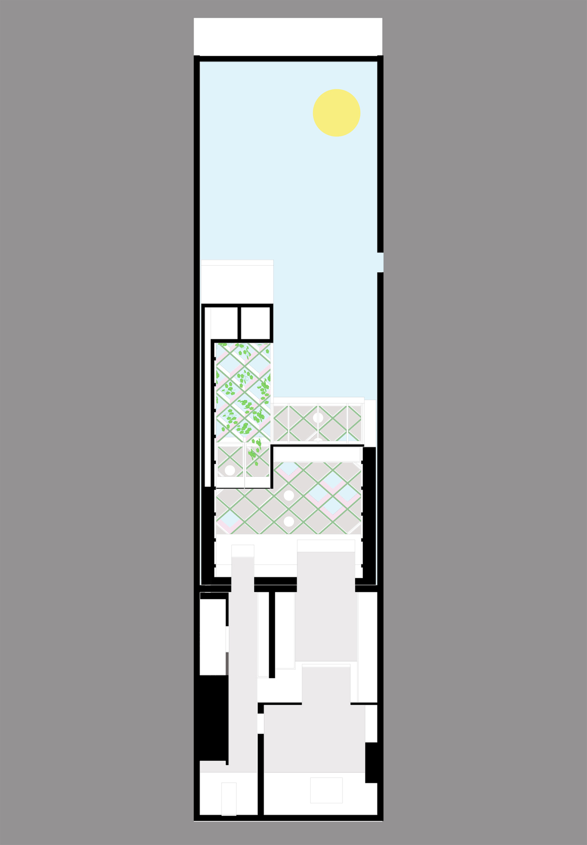
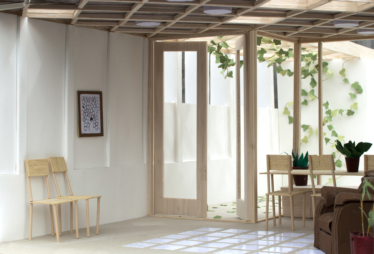
The beams above are slightly exposed to create a shallow coffer, although contemporary in appearance the filigree relief is reminiscent of Victorian orangeries and traditional conservatories. 1 large and 3 smaller proprietary roof lights form a loose constellation between the coffers and dictate the module. The roof lights are positioned so that a patterning of light moves across the wall over the course of a day as a second order to the architecture. Another pattern of circular ceiling mounted light-fittings form another order which becomes more visible at night.
Colour and polychromy are used as a way to mute the surface articulation of the ceiling and express the separate order of the roof lights to add richness, depth and atmosphere.
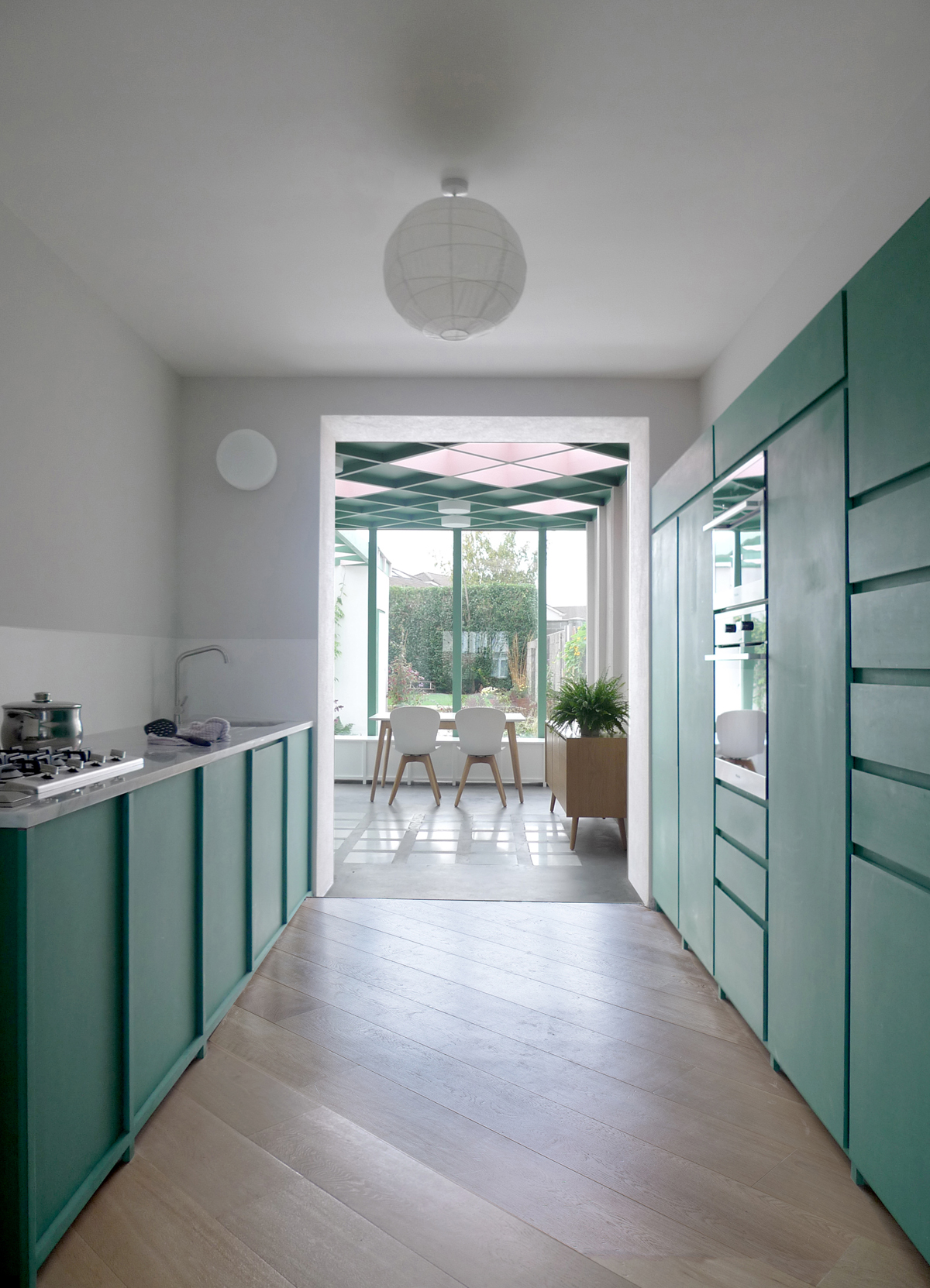
The original window opening to the back room is enlarged to create a generous connection between a new kitchen and a new family room. A counter and cupboards are constructed with green through-coloured Valchromat MDF accented by a polished marble countertop.
Drainage access is concealed in a small carpet of polished marble tiles embedded in a struck insitu concrete floor, left unpolished. The rug of stone suggests inhabitation and aggregate – a contemporary translation of a Palladian terrazzo.
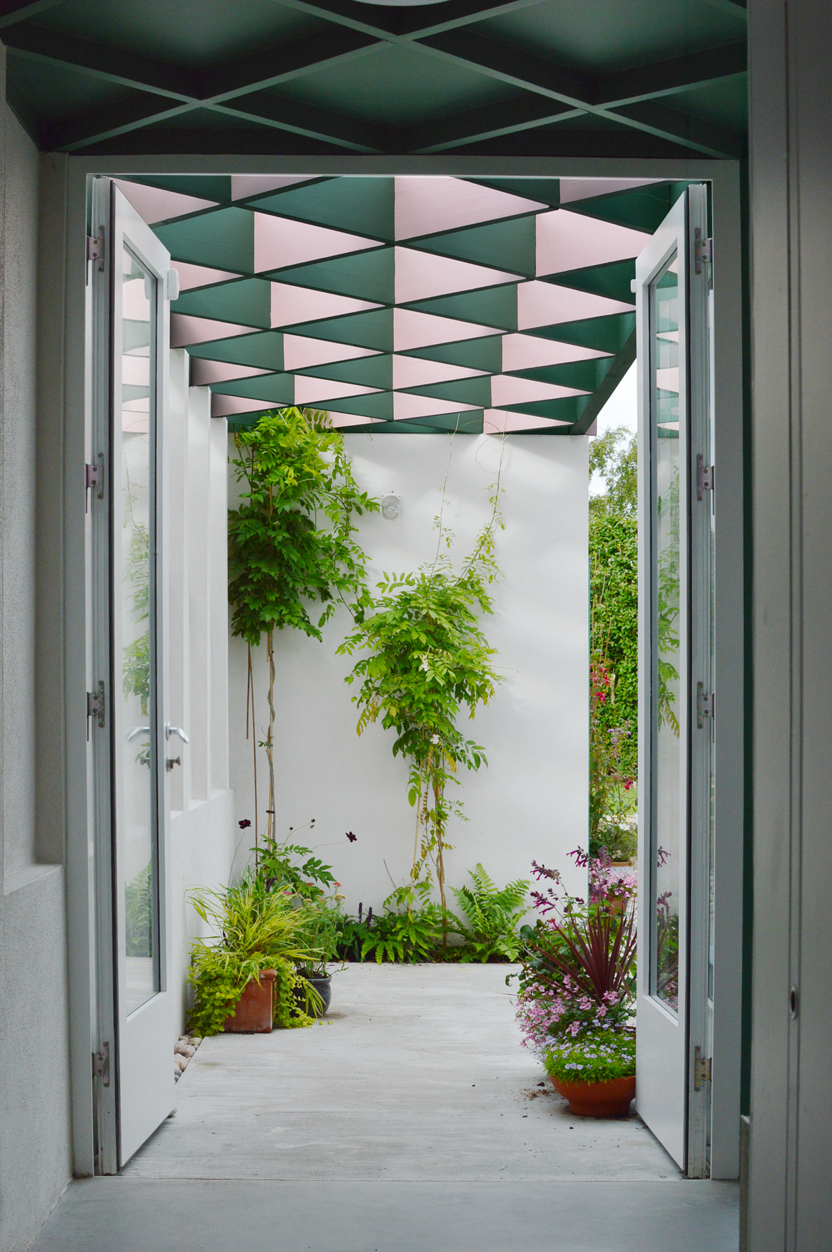
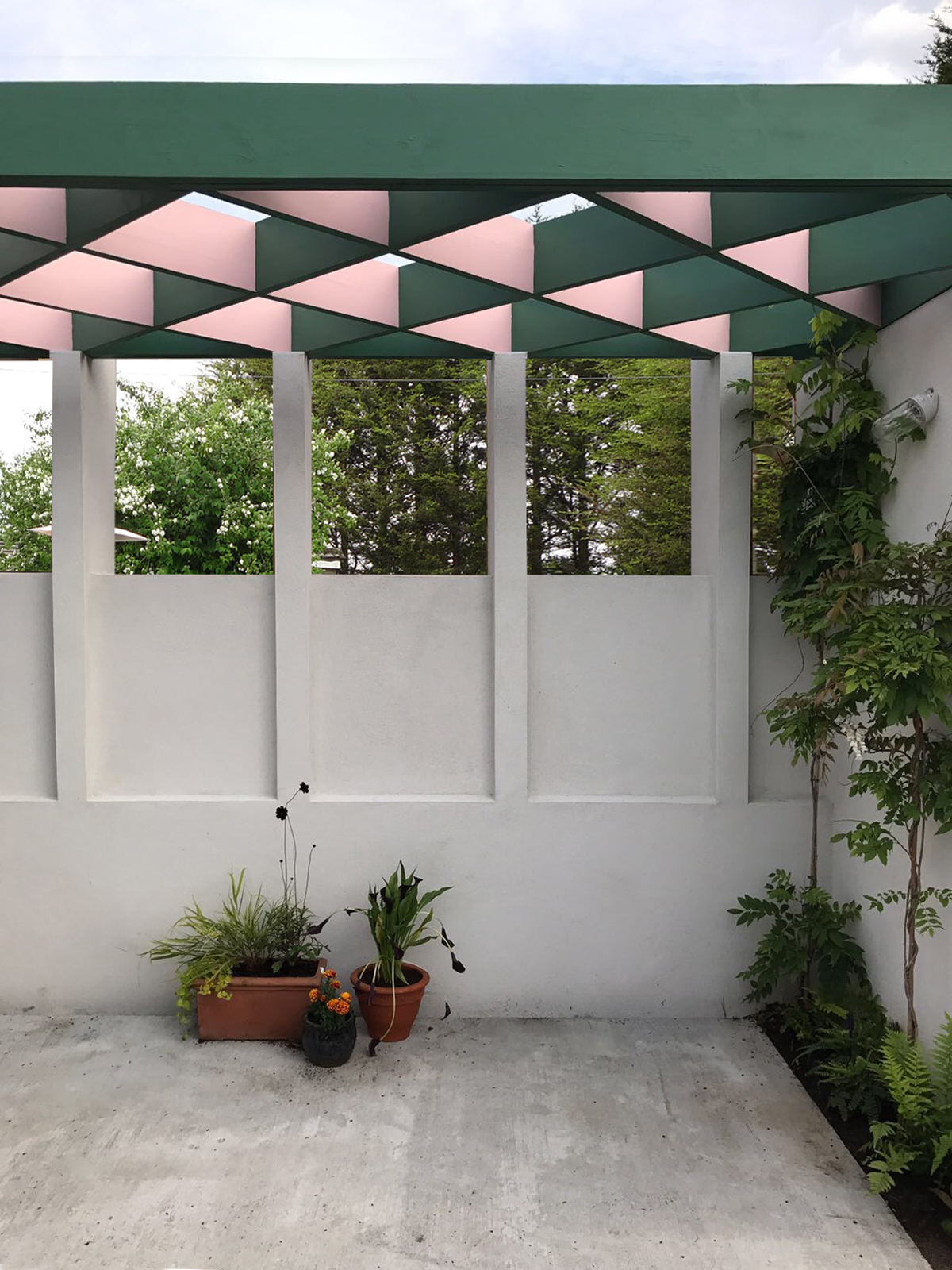
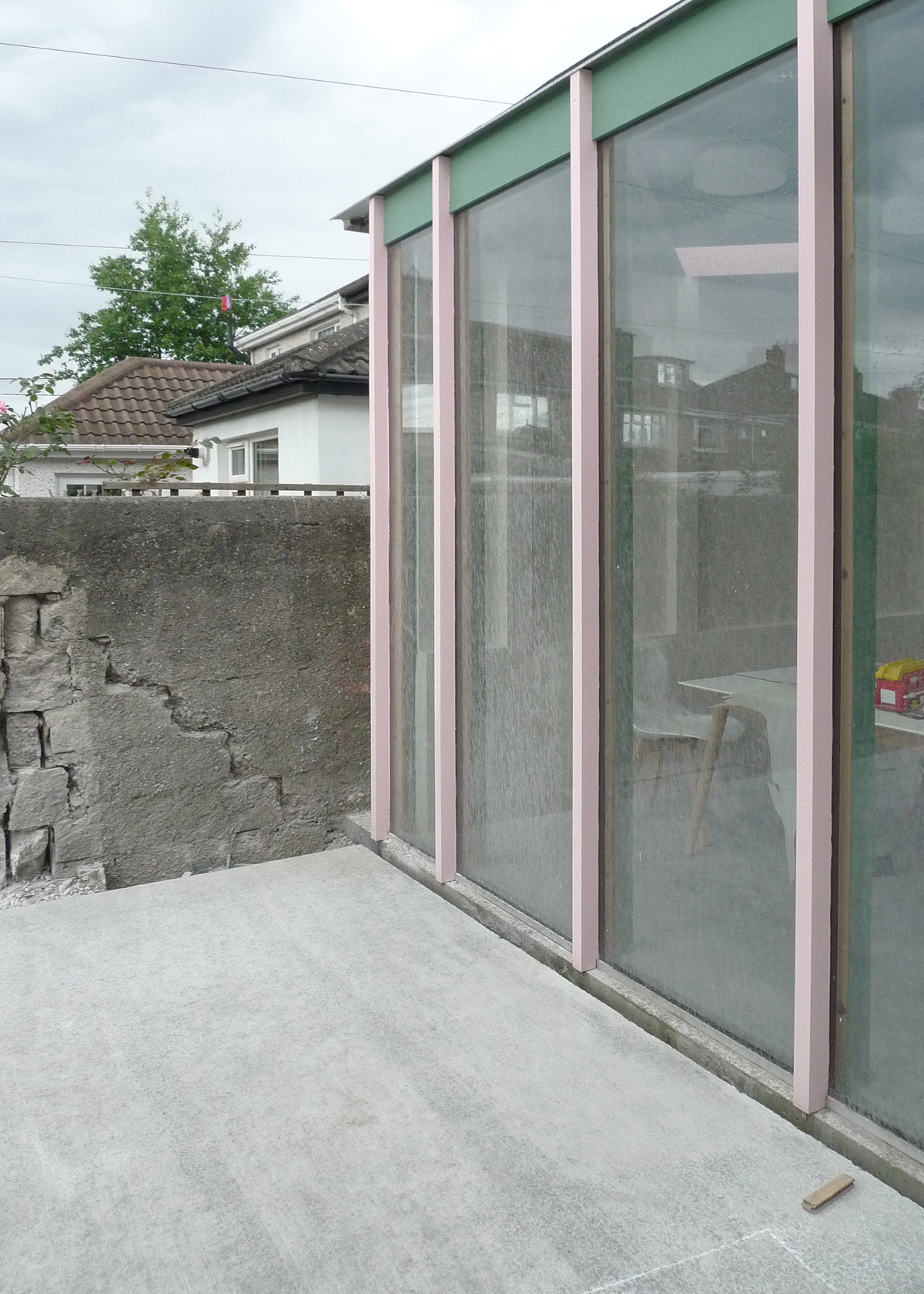
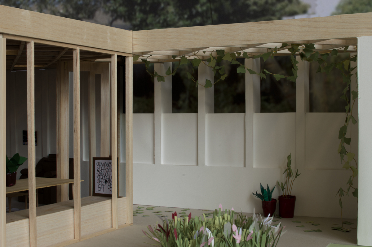
The plant and utility spaces are located in an outhouse in the garden. A wall connects this room back to the main house. The rhythm of the pilasters is continued along this edge but the wall between drops to acknowledge the lower boundary condition. The pilasters extend beyond the wall to form 5 exposed columns. This extended wall frames a new garden court with the columns protruding to hold the cross joisted ceiling structure which is now fully exposed forming a new open pergola hung with wisteria to provide shelter and shade.
Working to a limited budget we proposed to work where possible with ‘off the shelf’ components. Where elements needed to be put together onsite like blockwork and timber joists we proposed to put more effort into the design and elaboration of these assemblies to generate a character and atmosphere for the house. All doors, rooflights and the double glazed units are proprietary. The standard rooflight sizes therefore set out the module and spacing for the timber beams, which dictates the position of the piers and finally the proportion of the new room.
Everyday construction techniques and materials were chosen driven by a desire for efficiency – to design cost-effectively and economically. These inexpensive materials are easily sourced, and importantly, knowledgeable for the tradesmen and local builders.
We believe that a rich architecture does not necessarily mean an expensive architecture. Researching the architecture of the Arts and Crafts movement we have realised that what has happened over the last century with the reversal of expenditure in construction works from material to labour costs means a highly crafted architecture is beyond the means of most everyday budgets due to the increased cost of labour and decreased access to affordable skilled makers.
However taking inspiration from the arts side of this movement this house focuses on the traditional meaning of the applied arts and translates it into the contemporary setting – using design and assembly to enhance character and atmosphere where the construction and material costs would exclude. We call this approach ‘richly economical’.
Through detailed design resolution and ample allowance for construction tolerances we have used linings, skirting, plaster and paint to build in a design robustness allowing for a cheaper build onsite.
Artists like Richard Wentworth, Fischli & Weiss and photographers, Lewis Baltz and Thomas Struth are heroes of the office. They show that how through simple manipulation and re-evaluation sometimes the ordinary can be transformed into the extraordinary. Taking this approach the practice enjoys seeking novel ways at looking at what some may consider the everyday and banal and through new juxtapositions, exaggeration, and subverted associations to seek to articulate playfulness and delight.
With the rise of the modern movement in the C20th, functionalism and even minimalism became the norm. However this project take inspiration from the pre modern; a door can be much more than a door, and a wall much more than a means to enclose space. We reject the simplicity of the modernist extrusion of a plan and instead look at Alberti’s understanding of the wall and its possibilities to generate atmosphere.
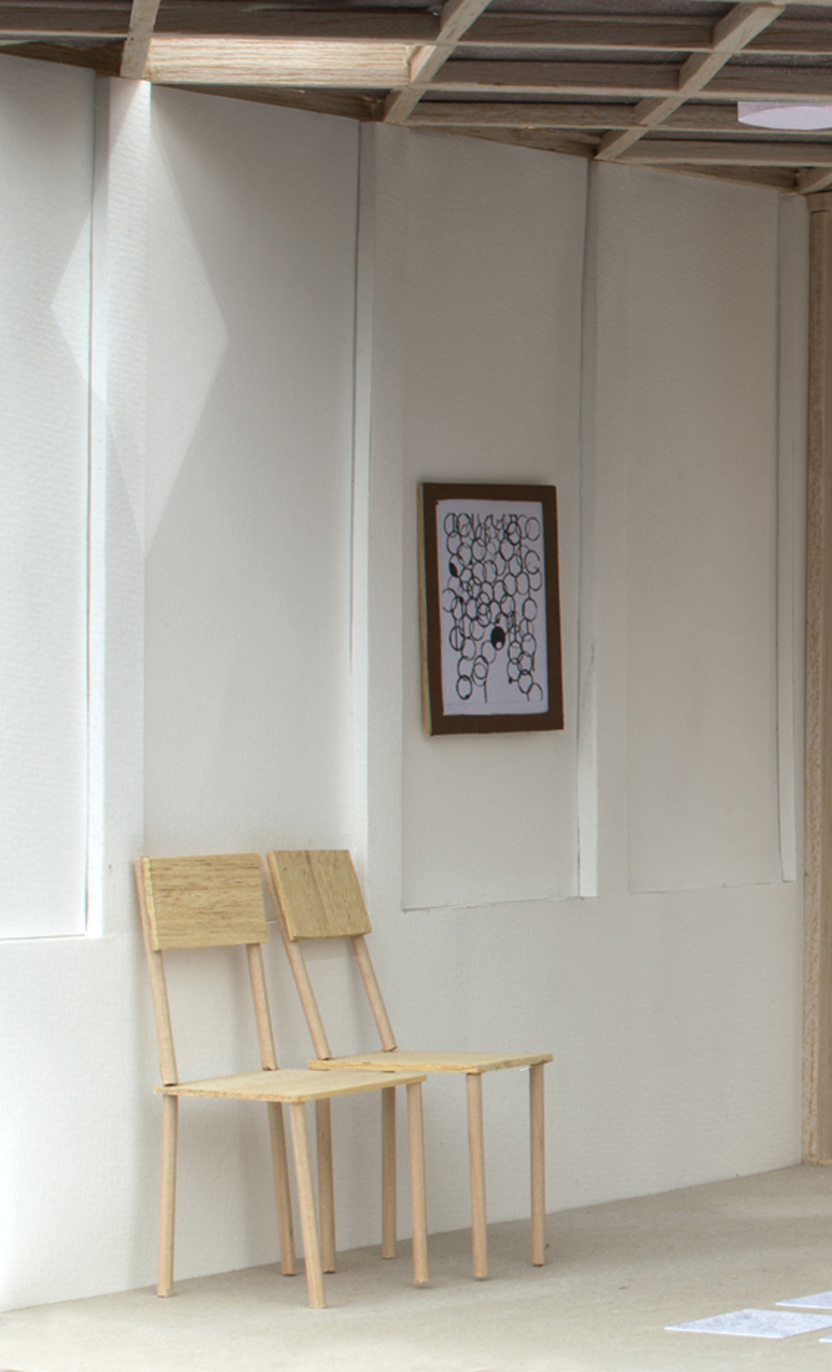
The design was progressed through line drawing, perspectival and projected, and large scale 1:10 paper & card modelling to replicate daylight, material and texture. Drawings are used to test ideas and communicate proposals both in constructional arrangement, empirical, but also atmospheric and experiential.
Completed: September 2017
GIA: 62.5 sqm
Construction cost: 57,750 euro (private)
Location: Dublin, Ireland
Esta entrada aparece primero en HIC Arquitectura http://hicarquitectura.com/2020/10/david-leech-conservatory-room/


No hay comentarios:
Publicar un comentario